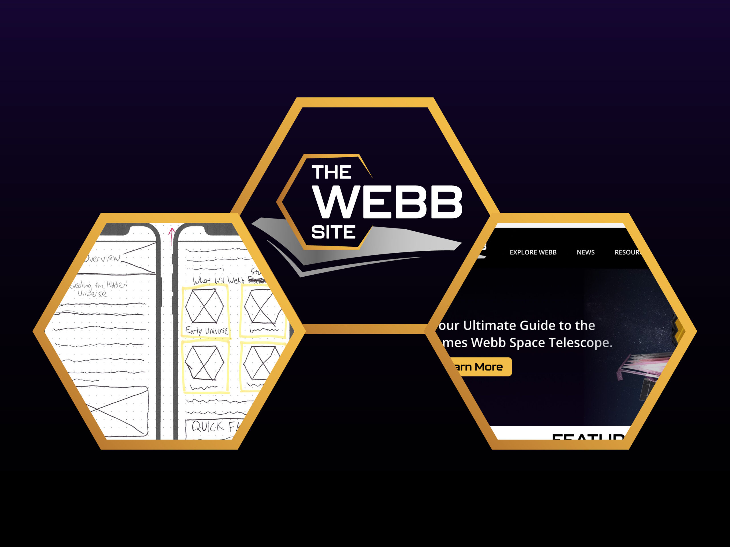
Over the past seven weeks, I have been developing a website prototype called The Webb Site. While the last six weeks was spent creating the plan, researching, gathering materials, and making the artifacts, this week has been mostly spent on finishing and tweaking the screens in Figma as well as packaging the project, including making the project page and the walkthrough video. I also have the opportunity to reflect on what I learned throughout this tedious but rewarding journey, as I will do in this post.
Last-Minute Revisions
Here is a rundown of some last-minute revisions I made to my project in the final week:
- I fixed the FAQ page, where there the expandable lists weren’t working properly.
- I added the Mission Timeline screen, which has an interactive timeline of the James Webb Space Telescope (JWST).
- I filled in more content where I found appropriate. The less important elements have sample images and text for now.
- I put more of my content layouts into auto-layouts once I learned about nesting auto-layouts.
- I finished making other screens, such as the general news pages.
- I prototyped most of the rest of my elements that required interactions for the walkthrough video, including trigger states, animations, and external links.
Furthermore, I was still on the fence on how far I would go with my project until I was satisfied to call my project presentable and complete enough to showcase on the Internet. After all, I didn’t get to making all screens in my information architecture. That being said, I thought that adding one more interactive screen that I did not include initially (the Mission Timeline) was probably enough for the user or client to understand the gist of the website.
What Went Well
Regarding Figma, at first I was struggling to use the software optimally. Even though I had used other prototyping software such as Adobe XD in the past, I had new challenges first this project:
- Responsive design. Optimally moving between mobile and desktop screens requires manipulating constraints, grids, and auto-layouts.
- Hover states. With desktop design, making overlays with hover states is necessary. This process took much longer than expected with my large navigation menu.
But, once I figured out that I could nest auto-layouts (put auto-layouts within auto-layouts), I was able to adjust individual elements—especially content in multiple columns—without needing to change everything else on the page; the content adjusts itself! Hence, I was able to duplicate screens a lot faster by just changing the content and values accordingly, with the rest of the layout adjusting for me.
In my opinion, my logo design phase went well. My industry experience with graphic design and Adobe Illustrator definitely gave me an advantage here. It’s not a perfect design, but I find it presentable given that I had very limited time to make it. I even learned a new Illustrator tool—the width tool—which helped me greatly with creating dynamic strokes.
Lastly, the idea of creating a responsive website prototype was my original intention from the first week, and I will say that I stuck by that and was mostly successful at making it despite my limited timeframe and removal of project artifacts.
Where I Struggled
Throughout this project, time was my biggest enemy, be it general time management or underestimating the amount of time it would actually take to thoroughly accomplish each artifact and task I had planned. Looking back at my original project plan, I will admit that I was far too ambitious. Initially, I had set these goals my project:
- Ideating and building 25-30 desktop screens AND 25-30 mobile screens
- Writing original content for the screens to be displayed
- Performing a user testing phase (which is an important step in professional UX design!)
But realistically, unless I was doing this project as a full-time job—which means putting aside my part-time jobs and life obligations—I did not have the time to accomplish all of this from my original proposal and plan in just seven weeks. The design phase alone—ideating the wireframes, choosing the brand interface, and just building the prototype in Figma—ate up most of my time throughout the seven weeks. I would go even further and say that learning how to use Figma more efficiently was half the battle (even though I eventually figured out ways to make it faster). Therefore, I had to adjust my project plan by reducing the number of screens to around a dozen for each device, and then entirely removing the user-testing and content-writing phases. I would be testing the prototype as I build it and either embed written content from NASA or insert sample text so that I would focus mostly on the design.
Also, my user research week (third week) was cut short due to a life issue, so I didn’t perform as much user research as I wanted to. I could have made five personas instead of three, and made other materials such as empathy maps. I probably should have set aside extra time in case a life event like this obstructs.
Moving Forward
Despite my personal and professional struggles throughout these seven weeks, I will say that this was a huge learning experience. My biggest takeaways for this project are:
- Early research as well as research throughout the process are equally important.
- The user is always first, even if your needs or values don’t align with theirs.
- Using Figma is challenging but rewarding once you figure out the tools for efficiency.
- Always test your product throughout the process! (a few things went wrong while recording the walkthrough video)
- Developing a responsive prototype alone is not easy, and it should be made and tested one device at a time (mobile first).
- Estimating the amount of time it takes to complete tasks is also not easy. Set aside extra time for emergencies and setbacks!
At this point, it’s a matter of deciding whether I would take this prototype even further beyond my assignment. An actual live website is quite possible. But at the very least, I can take what I learned—including adding Figma to my list of mastered software—and apply it to future creative projects.
If you are not familiar with the development process of my project, you can view my project page. You can also view my full prototype for both desktop and mobile screens below.