

Over the past seven weeks, I challenged myself to plan out and follow a design process in developing a responsive website prototype, which includes both desktop and mobile screens. My prototype, The Webb Site, serves as an information guide for the James Webb Space Telescope (JWST), delivering news and educational content regarding the JWST in the most elementary, user-friendly manner possible. In more ways than not, this prototype is a rebuild of multiple existing websites hosted by NASA and their partners where the information is currently held. The main goals of my project were to:
- Identify flaws in existing information architecture and rebuild it
- Practice delivering complex information in the simplest ways possible
- Improve my UX/UI and ideation skills, and learn new ones
- Learn a new professional tool (Figma) and then create content from it
- Practice responsive design
- Learn how to better manage time and appropriately delegate materials over the course of seven weeks
My Schedule
Each week, I delegated materials, documented my development process, and discussed challenges I faced as well as changes to my initial project plan. Below is the schedule of materials I followed as well as links to their respective blogs that further explain my processes. The following sections will summarize each of the materials in more detail.
- WEEK 1: Project Proposal
- WEEK 2: Project Plan
- WEEK 3: User Research—Competitor Analysis & Personas
- WEEK 4: Information Architecture & Beginning the Wireframes
- WEEK 5: Finishing Wireframes, Logo Design & Learning Figma
- WEEK 6: High-Fidelity Screens & Prototypes with Figma
- WEEK 7: Finishing & Packaging the Prototype
The Project Proposal
My journey began with formulating my project proposal, which helped me greatly with finding a clear direction to take my project in. By identifying the problem, proposing a solution, and creating an artifacts list, I was able to much more clearly define my goals as much as whichever client(s) would be reading it.
You can read the full proposal below.

The Project Plan
After creating my project proposal and getting it approved, I went on to create a project management plan. By doing so, I have been able to organize and visualize my ideas, delegate materials, establish clear tasks, and refer to a structure throughout my seven weeks. It has also given me the opportunity to reflect on what I didn’t accomplish and why, what revisions I made to the plan and why, and what I could learn for the future.
You can read the full project management plan below.

User Research
With my project plan in place, it was time to start off my design work through user research. This was a crucial part of my process because it helped me identify my target audience and clarify what potential users wanted to see on The Webb Site. There are many tools used for gathering user research when making a product, but two that I found to be very powerful, versatile, and applicative to my project were competitor analysis and user personas. In my user research blog post, I identified and analyzed the strengths and weaknesses of the UX and UI of the “competitor” (in this case the competitor was NASA’s multiple websites that hold JWST information). This gave me inspiration for how I could rebuild the architecture and expand on current interface elements for my prototype. I then translated the problems I identified into three comprehensive user personas, which are linked in the picture below.

Information Architecture
The user personas, especially specific elements within them such as goals and user scenarios, greatly helped me with my next step: building my information architecture. I decided to approach this phase my creating a sitemap, where I tried to emphasize content and tasks that each persona wanted to perform, including news and educational materials.

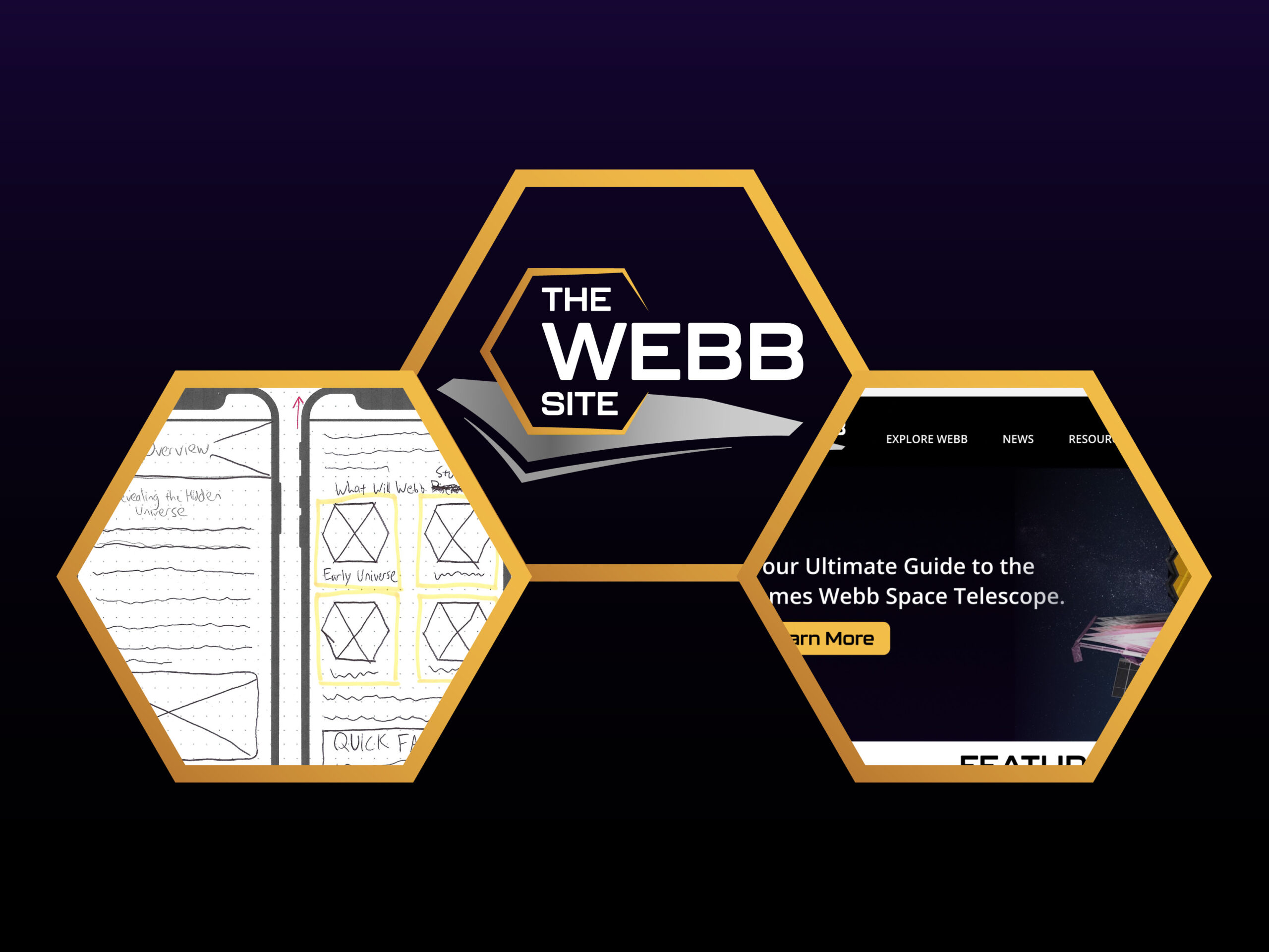
Low-Fidelity Wireframes
With my sitemap created, I was ready to ideate the basic layouts and functionalities of The Webb Site with basic wireframes. For this, I decided to go old-school and use pen, paper, and highlighters. This phase turned out to be tougher than I thought because it required extensive research into UX and UI trends, especially for important main pages such as the home, news, and contact pages. I created desktop screens, then created mobile screens. While both devices should store the same information, the interactions are different, especially regarding the navigation menu.
You can view all my wireframes by clicking on the pictures below.


Logo Design
At this point, I was ready to move towards putting together the aesthetics that would land the first impression on every user who visits the site. After deciding on the color palette and fonts to be used on my website, I had to develop my site’s brand identity via logo design. The challenge was to keep the design simple while having it be unique and eye-catching enough to capture the brand identity I want. After some logo design research and a few hours of brainstorming sketches, I came up with this design.
High-Fidelity Wireframes with Prototyping
All the research, ideation, and design phases led up to this main point: creating a presentable, functional, and aesthetically-pleasing website prototype. This required learning tools in Figma such as components and auto-layouts, troubleshooting as I build, making the aesthetics and layouts consistent, and then prototyping all the interactions.
You can view the clickable prototype for both desktop and mobile screens as well as the full walkthrough video below.


You can also read my reflection on my final body of work, my process throughout the seven weeks leading up to it, and areas for learning and improvement.


