

After performing and documenting user research last week, I finally get to begin performing the design work for my website project. However, just like starting anything, the first step in this design journey is arguably one of the most difficult ones: figuring out how to organize my content. Nonetheless, in UX Design it is crucial that one develops an information plan to move forward with, and I have learned a lot from doing so.
This week, I decided to approach my content organization by using two tried and true methods: information architecture and wireframes.
Information Architecture
In a nutshell, information architecture (IA) is the practice of organizing content in an effective manner. Before building the website, there are many questions one must ask themselves: How are the users going to find what they need? How quickly will they find it? What happens when users don’t find it right away? All of these questions are vital for designing an effective, functional website, and it is the Information Architect’s job to organize all content in a way that effectively addresses all of these questions. For clarity, senior Information Architect Dan Brown devised 8 principles for building effective IA. The principle of choices (less is more), and the principle of classification (offering multiple ways to browse the site’s content) are ones that I especially kept in mind for building my site’s IA.
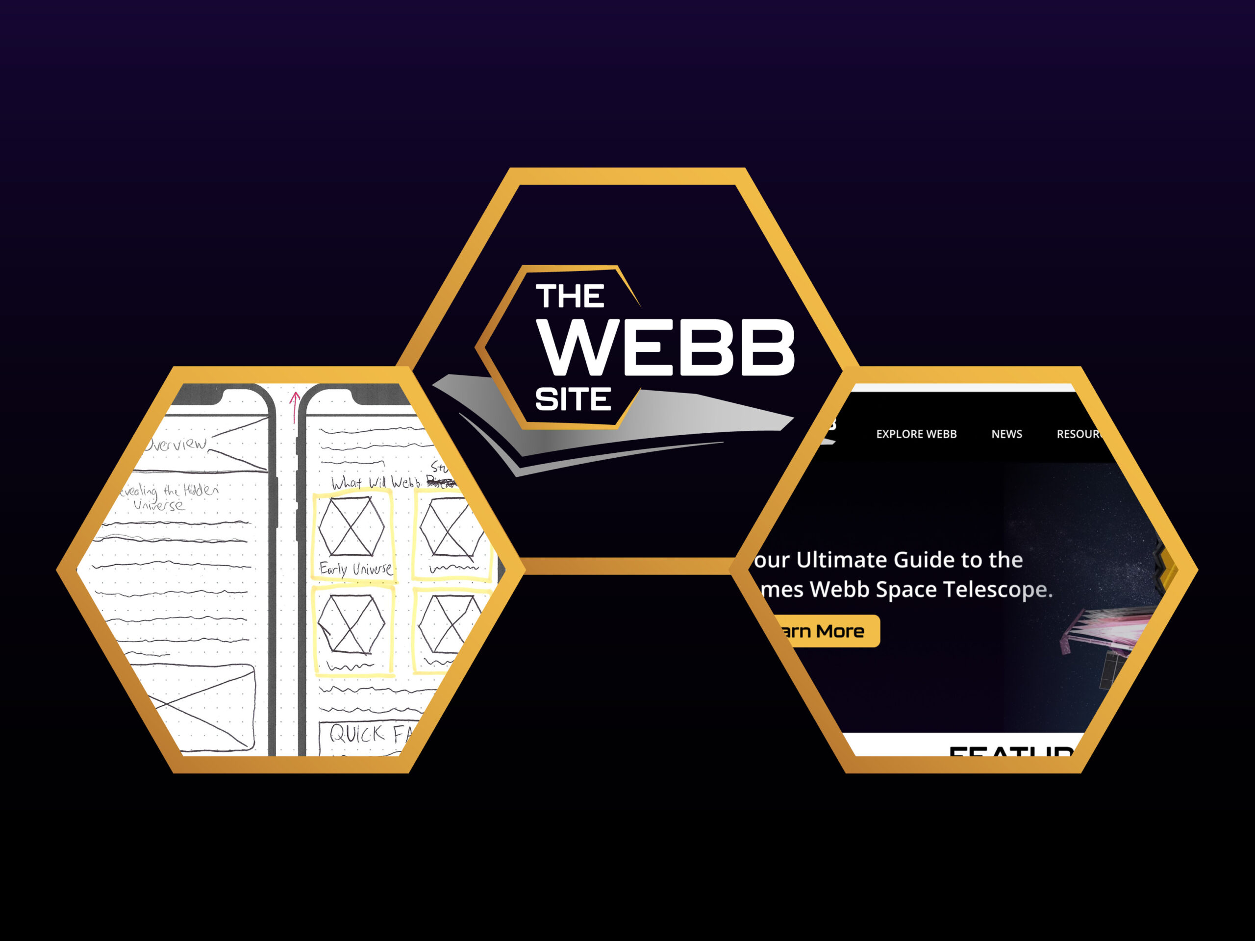
The most common method to build IA is to create a sitemap. Although the sitemap for my IA looks relatively simple, trying to make it this simple was the most difficult part. My main goal for my project is to simplify the information on the James Webb Space Telescope (JWST) found on NASA’s multiple sites; therefore, I really needed to apply the “less is more” mantra here.

Each rectangle represents a page or main menu button. Each page may contain a myriad of content, but all of that content should fall under a specific category that the page offers. This strategy is not unheard of on the web, but deciding how to categorize information can get quite tricky (and it was for me).
I knew first and foremost that the navigation menu should be easily accessible on every page via hover, not hamburger menus. Additionally, I wanted to include original content, embedded content, and external links, so I classified them in the IA key. The ‘News’ menu button is also a page of its own.
Wireframing
After creating the IA sitemap, making wireframes is an effective way to brainstorm and visualize the content you just mapped out, towards the beginning of the design process. Essentially, wireframing gives a clear overview of the page structure and the application of design principles including layout, hierarchy, flow, functionality, and behaviors. There are also different tiers of wireframes, from low-fidelity (basic layout with no aesthetic details) to high-fidelity (with most of the details). But if you are just beginning your design, then creating low-fidelity wireframes first will be more efficient.
Mobile responsiveness is crucial for any website in today’s world; therefore, for this week I had initially planned to complete 10-20 wireframe screens for both the desktop and mobile versions. However, the process of researching wireframes and effective practices, and then actually sketching out my ideas formulated from that research, was taking much longer than expected. Hence, I was only able to focus on sketching desktop screens this week. The bright side is that I know exactly what I am doing for the mobile wireframes; I only need to adjust the layouts.


For my home page design, I had to make sure that it included big text, multiple calls to action, room for attention-grabbing visuals, and most importantly, a voice for my target audience.
Although low-fidelity wireframes do not need to be polished, I needed to be very careful about where I put my information (which is a big part of why this process took longer than expected). Nonetheless, it should pay off, because now I have a much clearer design direction on how my high-fidelity prototype is going to look.
You can view the full desktop wireframe documentation here.
Final Thoughts
Planning and organizing content from an idea is not easy and can be tedious and time-consuming. However, this step in the design process is important and will save time in the long run because when you get to making your prototype, you can focus on the details rather than trying to figure out how to organize information. Although my wireframes are not yet complete (I still have to make the mobile screens), once I do then I will have the necessary framework to create a detailed, functional, and responsive website prototype.


Comment on “Beginning My Website Design: Planning and Organizing the Content”
Comments are closed.