When a new design project arrives on your agenda, you may be eager to jump right into creating it. Or, you may dread it and just want to get it over with. But, one critical step in the design process that you would be missing is user research. Without user research, your project could potentially accomplish nothing for no one. Maybe you are indifferent on what others may think, but if you or your job cares about the audience’s needs, or even what kind of audience you wish to attract, then conducting user research is a huge necessity.
There are many different effective user research methods, including but not limited to: user interviews, surveys, empathy maps, journey maps, user personas, and competitive analysis. Regardless of which ones you use or how many, getting to understand your user is a must!
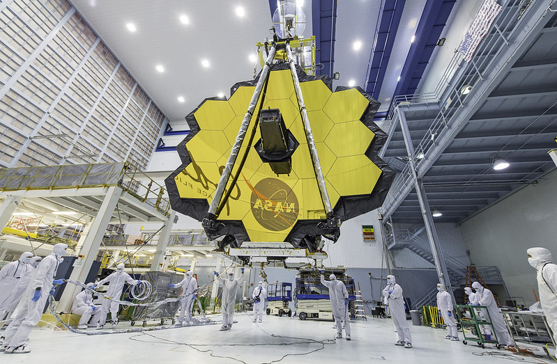
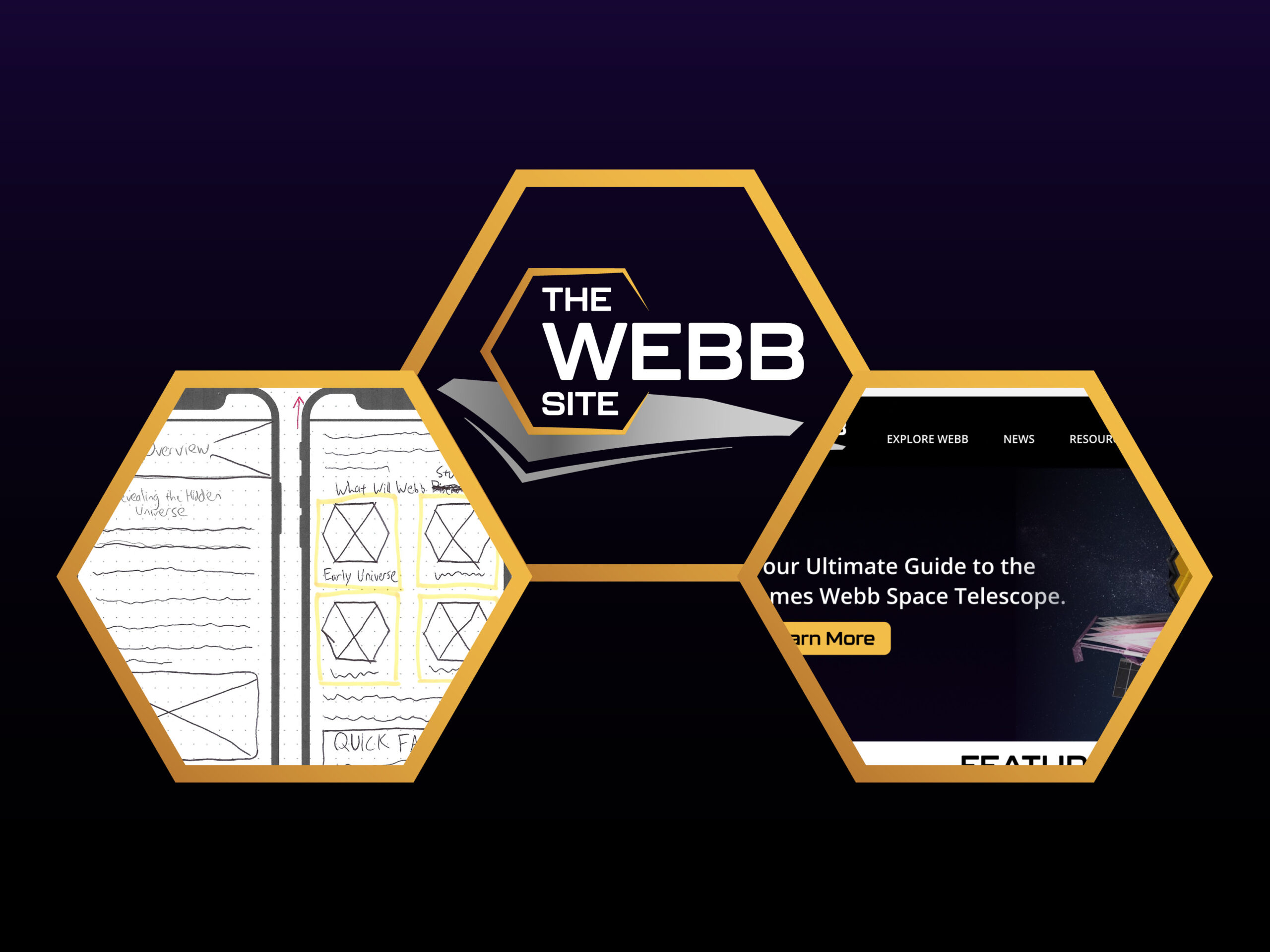
For this week, I decided to put my focus on analyzing the “competition” regarding my intended product and creating three user personas. For context, my project is to create a website prototype, called The Webb Site, that will act as a reduced and simplified version of NASA’s multiple websites where information on the James Webb Space Telescope (JWST) is held. It will convey educational information in an elementary manner as well as provide and organize external links to other resources, including those found on NASA’s sites.
With all these things in mind, I know which ‘competitor’ I am analyzing (NASA’s JWST sites) and I have ideas on who my users would be.
Analyzing NASA’s Website(s) for the James Webb Space Telescope
Competitor analysis allows you to identify the strengths and weakness that users are facing on competing products, which will then help you make more informed decisions on your own product strategy. You may analyze qualitative data and/or quantitative data, depending on you or your company’s goals. For the sake of my project, I decided to analyze qualitative data (that is, UX/UI design choices) on NASA’s websites.
First of all, when searching Google for James Webb Space Telescope, it makes logical sense that a NASA-affiliated site would show up first. That is the case here. On the home page, there is good contrast between the text and background, and there is a clear distinction between text and links (white vs gold).


However, you may notice that most information is hidden in the controversial ‘hamburger’ menu. And, within this hamburger menu you will discover (if you haven’t already) that there is not one, but four sites among which JWST information is distributed.
While hamburger menus are not always bad (they can be good for storing secondary information or saving screen space on mobile sites), NASA’s desktop sites seem to heavily rely on them for most of everything. This, coupled with the fact that there are four sites, would probably overwhelm the average user.
Furthermore, on NASA’s JWST science website, some of the aesthetic ideas are nice, including the hexagonal image shapes. But what is strenuous to the eye is the lack of padding; that is, the text spans almost entirely across the page.

Overall, every design choice, big or small, from the structure to the little aesthetics, has a huge impact on the user and is often the difference between a user returning to the site frequently or never again. While my website prototype won’t hold all information found on NASA’s sites (there is a LOT!), I will have to make sure to address each of the aforementioned user issues and more.
Creating My User Personas
In a nutshell, a user persona is a fictional representation of who your ideal users are. They are excellent tools for building empathy with those potential users by allowing you to define user problems and clarify behavior patterns, needs, and pain points as they pertain to existing competing products and what you wish to produce.
Personas may contain a plethora of information depending on the context of your project, but usually it should include a fictional name and image, demographics, bio, goals, needs, frustrations/pain points, and a scenario. For my personas, I wanted to make sure each of them were unique; therefore I produced three of them like such:
- A not-so-tech-savvy retiree who gets frustrated with clunky technology and wants things simple
- An adult woman who loves astronomy as a hobby but has little time on her hands
- A younger man who recently learned about the JWST and wants to learn more

I also included user scenarios from the perspective of each persona to more clearly define problems and how the users may interact with the website.
You can view the rest of my personas here.
Final Thoughts
I could have just jumped right into creating my website prototype without doing any of this user research and analysis. But by analyzing the ‘competitor’ and creating user personas, I was able to identify my target audience and define the problems that I will try to solve through creating my product. Ultimately, the user research helped me better decide on the features that my product would include, which is the main task for any product designer.


Comment on “Preparing for Action with User Research”
Comments are closed.