
With every product design there is a process consisting of many steps, and my materials for this week show no exception to this. Last week, I began building the framework for my website by creating an information architecture sitemap and then some low-fidelity wireframes. This week, I proceeded to gather materials (including finishing my wireframes) for my end-goal, which is to have a high-fidelity website prototype for both desktop and mobile screens. The other important materials include developing my brand identity via logo design as well as learning and practicing Figma, which is the software I am using for the prototype.
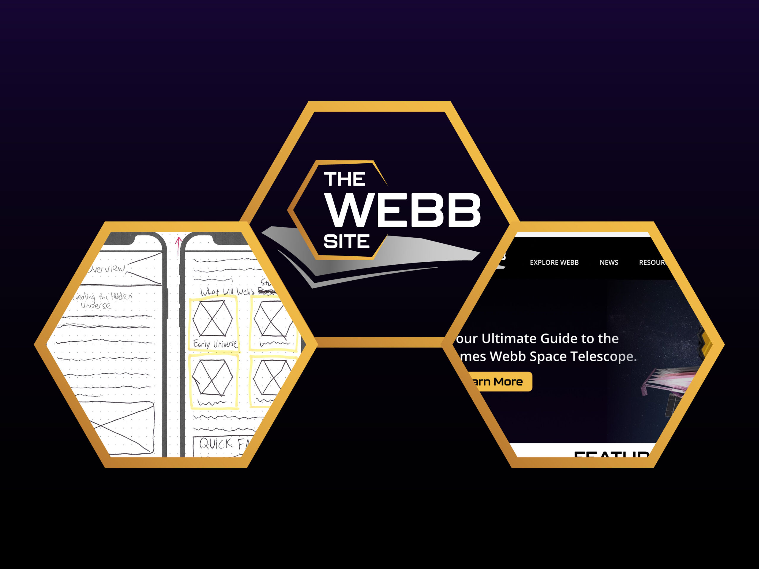
Mobile Wireframes
Last week, I noted that wireframes provide a clear overview of the page structure and the application of numerous design principles. Because mobile screens have to fit content on a much smaller viewport, they require different layouts and content organization, and in some instances subtracting features altogether. Therefore, I found it essential to make mobile wireframes in addition to desktop ones when designing my website.
Furthermore, I thought that approaching the desktop wireframes first would make things smoother for the mobile ones. However, what I learned based on research this week is that designing for mobile screens first is actually the more popular and optimal approach in UX design, because designers have a more difficult time subtracting content and scaling down than the other way around.

The big difference between the mobile and desktop homepages is that I had to reduce the amount of columns to one (two at most) to make the content readable and, most importantly, interactable. The same case applies to most of the other screens.
Because I had already fleshed out many of my ideas from the desktop wireframes, it did not take as long to make these. However, due to limited space I had to make sure that some content was hidden from immediate view but still easily accessible, such as the use of the hamburger icon for navigation. That being said, referring to my information architecture, I had to make sure the navigation was not too complex so that the user is not confused or overwhelmed when viewing the menu.
You can view all of my mobile wireframes here.
Logo Design
For any brand, first impressions are everything; therefore, a simple but effective and well-researched logo design can make or break a brand’s core identity. On the surface, designing a simple logo may seem, well, simple to make. But, to create a simple design that will effectively elevate your brand is anything but simple. With endless creative opportunities out there, it is easy to fall into the trap of poor logo design practice. This blog post highlights 15 principles that are crucial for creating an effective logo that will capture a brand’s identity.

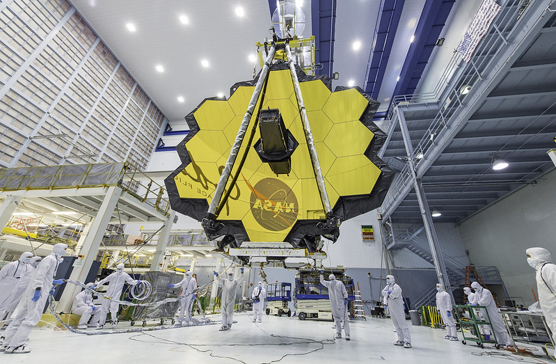
For my logo, I found it necessary to start at the drawing board and play with numerous concept ideas. Using Adobe Illustrator, I sketched out many concepts including what is shown above. For inspiration, I used reference images such as other logos and the James Webb Telescope itself.
Eventually, I ended up going with this design. The factors that went into the decision-making process include making sure:
- The font is space-themed but readable and not too polarizing
- The color palette is not too complex
- The logo is versatile; that is, it can go on light AND dark backgrounds with just one change in the font color
- The logo overall is visually interesting but not too detailed or cluttered
As expected, the logo design process took a while. But thankfully, with my past work experience with Illustrator and logo design, I ended up creating something that was visually interesting but not too complex. It’s not perfect, but I think it captures the direction I want to move in identity-wise.
Learning and Practicing Figma
With my paper prototypes and brand identity in place, at this point I am ready to learn and practice Figma. For context, I am not new to prototype software; I have used Adobe XD and Marvel POP in the past for other design work. That being said, this is my first project using the Figma software.
In a nutshell, I learned this week based on my research that Figma is not much different from Adobe XD. The software uses familiar features such as layers, components, masks, importable content (images, SVG’s, fonts, etc.), and the ability to make responsive frames and grids.

I also needed to learn a bit about responsive design in Figma so that I can make the transition from desktop to mobile screens and vice versa. Luckily, the software has a variety of tools to aid in responsive design without my having to make everything from scratch for a different viewport. I will still need to manually adjust the layout in many cases, but the responsive tools such as constraints will help smooth the process as I proceed with making the prototype.
Moving Forward
While I have only just started making the high-fidelity screens, through my research and practice with Figma, I am comfortable enough with the software to proceed. Now that I have completed my low-fidelity wireframes, developed a clear brand identity, and familiarized myself with the numerous tools that Figma has to offer, I am all set to get into the design grind for my high-fidelity website prototype for next week.


Comment on “Gathering My Materials: Mobile Wireframes, Logo Design, and Learning Figma”
Comments are closed.