In last week’s blog post, I discussed the importance and practicality of paper prototyping as it pertains to UX design, and argued that its many benefits make it more than just a bunch of office supplies. But there was one major point that I didn’t emphasize, and that is how useful paper prototyping is for usability testing.
The Importance of Usability Testing
Usability testing is defined by usability.gov as the evaluation of a product or service by testing it with representative users. Usually, participants will be assigned typical tasks to complete within a product while being observed and assessed by the designer. The ultimate goal here is to identify areas in the product that work, don’t work, and can be improved upon. Feedback and questions from the participant are encouraged to aid the evaluation.
Design is often described as an iterative process, meaning that steps are expected to be repeated, especially with prototyping. But, it’s equally important to make sure that testing each prototype via usability testing is a repeated step as well. Remember: you are designing for the user, so you cannot properly assess a prototype without getting your users involved.
Paper Prototyping As a Usability Technique
Any testing is miles better than no testing at all, so if you don’t have the budget to run multiple full-fledged tests using hi-tech software, you can always use informal, alternative methods so long as you are doing something to test.
This is part of what makes paper prototyping so useful in usability testing. The prototype itself does not use a high budget, and conducting tests using paper saves a lot of time and effort for both the designer and user—no HTML, Adobe XD, or Sketch required.
In fact, paper prototyping has been successfully used to improve upon large and well-known products such as the browser Mozilla Firefox.
There are numerous ways to effectively test products using paper prototypes, but the following testing exercise is just one interesting yet cost-efficient way to do so.
My Usability Testing Exercise
As a continuation of my ongoing MyGoNorth companion app project, this week I conducted tests on two users for my first paper prototype of the app. This MyGoNorth companion app would be designed to help tourists, residents, chamber members, businesses, and development contractors alike learn more about what goes on and get more involved in the North Country, a region in Northern New Hampshire and Northeastern Vermont.
I constructed the test by putting my paper prototypes in a free app called Marvel POP (Prototyping on Paper), which allows me to upload and organize images of my paper screens as well as add links and vectors to create the navigation experience and enhance the interface.

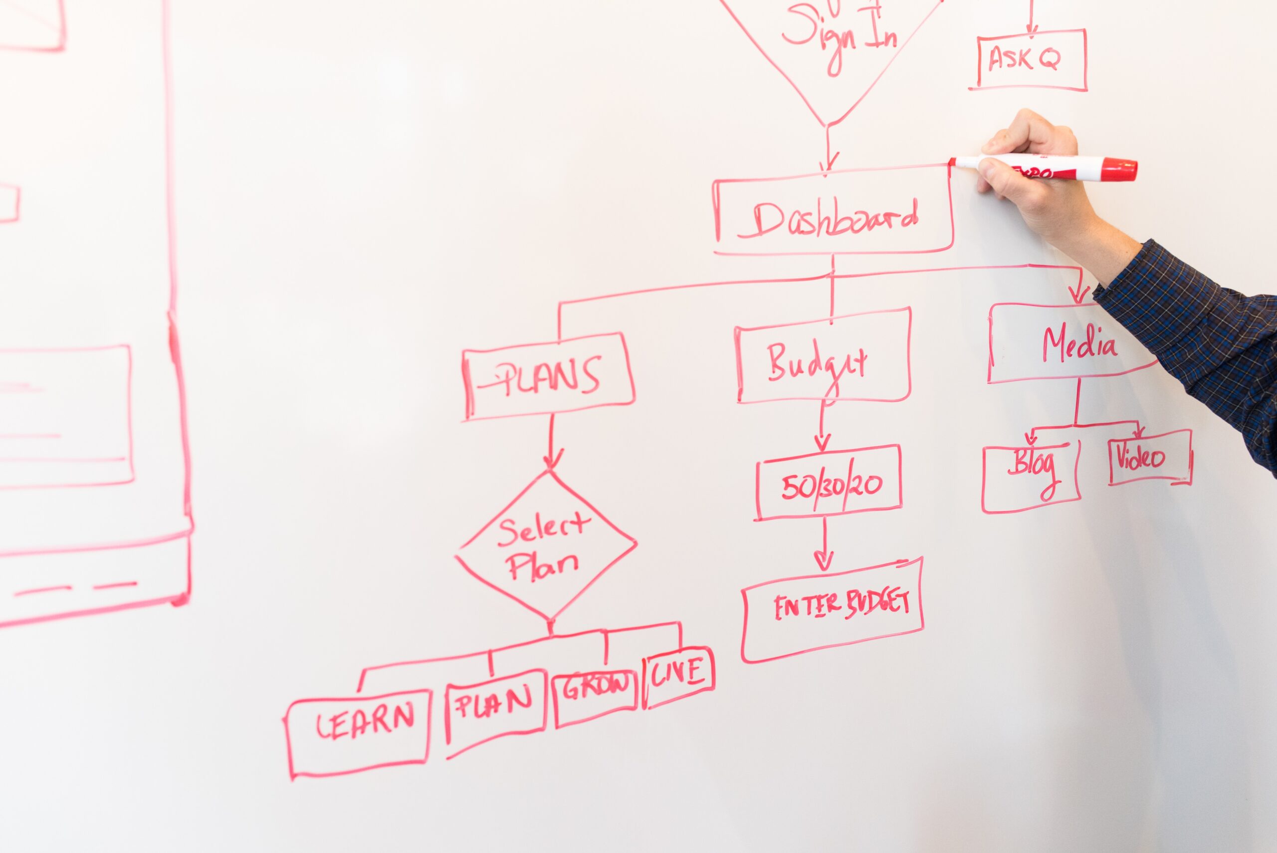
In order to conduct the tests using reasonable amounts of interaction with the information architecture shown above, I assigned each participant three tasks from the perspectives of three typical users. They are as follows:
- You are looking to visit the North Country for the first time. You want to find out what there is to do up there. You also want to find good businesses using the Business Directory.
- You are a new resident in the North Country. You want to subscribe to the newsletter so that you’re in the loop on what is happening in the area. You also want to check out an event that you heard of and that you wish to attend.
- You are the owner of a new inn in the North Country, and you want to become a chamber member so that your business is put on the map. You will need to apply to become a member. Then let’s say your application was approved; you would then need to login as a new chamber member.
As you can see, we have the tourist, the resident, and the business owner. They are three different users that are nonetheless all important intended audiences for the app.
For the user screens, there were 27 in total that each user could interact with during the test. They include each user task as well as general navigation through the footer tabs. I did not hand-draw any more than I originally had from last week, but I did decide to add pop-up screens to denote form submissions via the Marvel POP vector feature.

Luckily, both participants were able to complete the user tasks with the screens given in a reasonable amount of time, with only a few hiccups mostly due to missing links and my own mistakes. Otherwise, they had the right ideas.
During and after the test, each user provided feedback and questions which I found valuable, even if they didn’t go into much detail. All feedback is good and necessary feedback. Their overall response was mostly positive, and the few negatives were definitely valuable to know and consider for change.
Wrapping It Up
This exercise proves just how important usability testing is in the Design Process and how surprisingly useful paper prototypes are as opposed to high-fidelity prototypes. Not only did my user tests allow me to discover what works and what doesn’t, but they also allowed me to identify errors that came from my own mistakes with creating the test, such as missing links or incorrect screens to which the links were directed. Had these tests not been conducted, these mistakes might have gone unnoticed.
I probably should have added more screens to let users navigate the additional ways to complete the tasks (some of them can be done in more than one way). This is especially true for the Chamber Members dropdown category, which both users had questions about. However, this is all good fodder for improvement in additional prototype iterations, which are absolutely crucial for creating a well-polished final product.
You can view my full findings and links in the PDF below.


