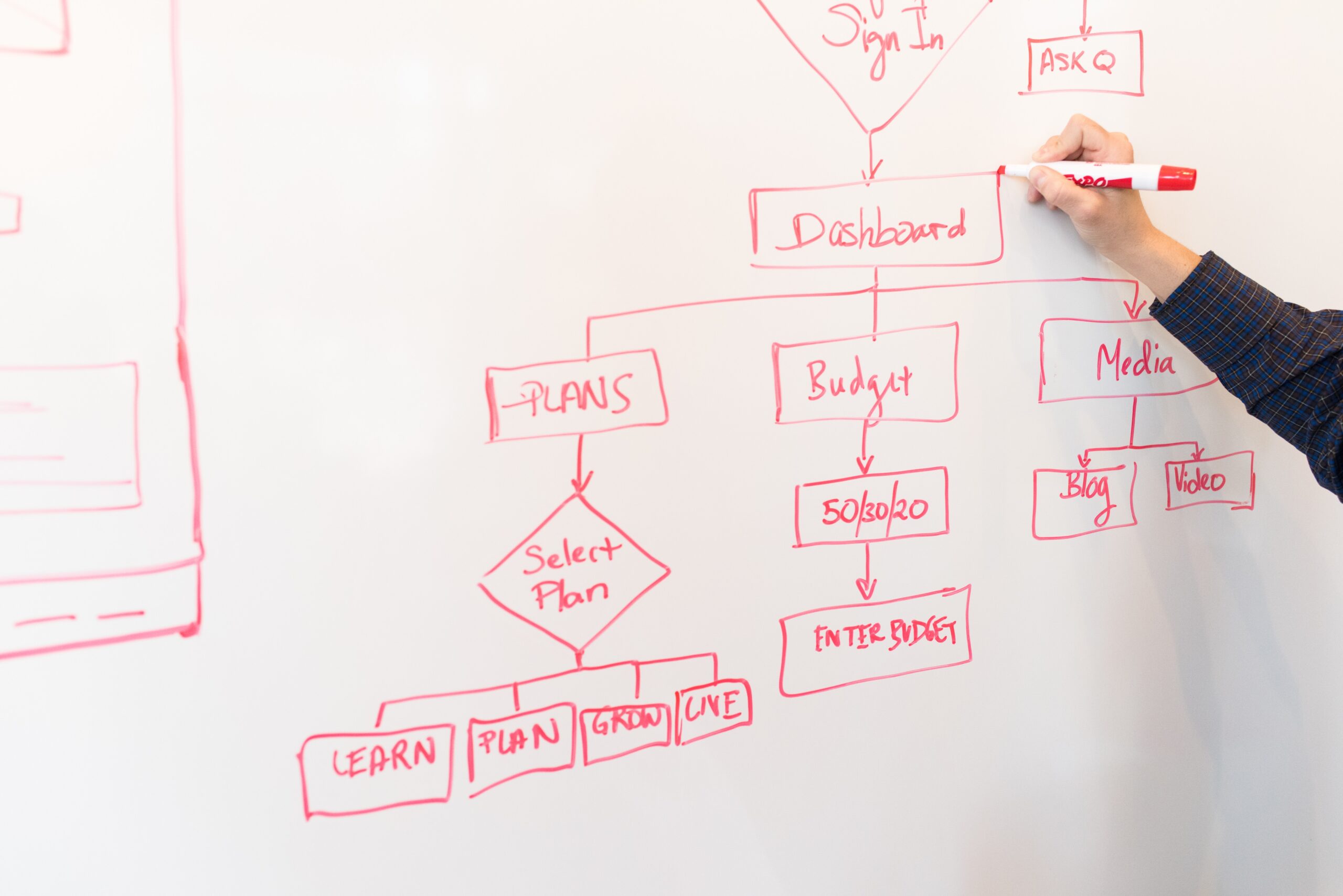
Prototyping is a fundamental step in the Design Thinking process. It is defined as “an expression of design intent,” allowing us to develop our ideas and use them as test subjects before bringing anything to life.
Over the past few weeks, I discussed the importance of low-fidelity paper prototyping as well as usability testing as it pertains to the MyGoNorth companion app project I have been working on. But, now comes the point in the process where I have made my first true medium to high-fidelity prototype, and there is a lot to share about my experience.

Why High-Fidelity Prototyping?
Once we go through user testing and identify the areas for improvement with the low-fidelity prototype, it makes logical sense that we cannot just jump straight to the end product; there can still be plenty of unidentified problems. Therefore, we need to create a more polished prototype that more closely resembles the product we wish to deliver to the world.
The ‘fidelity’ of a prototype depends on the quality and quantity of factors such as visual design, content, and interactivity. If low-fidelity prototyping can be defined by using simple, physical elements such as paper and pens as a starting point, then medium-fidelity and high-fidelity prototyping would be bigger, closer steps toward delivering a final product. Medium-fidelity may still lack some functions and details, while high-fidelity tries to resemble the end product as closely as possible.
Advantages of high-fidelity prototypes include:
- Better aesthetics: At this stage, it’s time to start caring a bit about the details. If visual design is not your strong suit, then construct a detailed layout for someone else to fill in with color schemes, fonts, and images later.
- More efficient testing of interactions: Having software that allows for clickable links, transitions, scrollable elements, and overlays will better help you and the user feel the product.
- More accurate feedback: The more the prototype looks and behaves like the intended product, the more accurate your user feedback is going to be.

MyGoNorth: My Prototype
To practice medium to high-fidelity prototyping (I consider my prototype to be in between the two), there were a number of software options available for me such as Sketch, InVision, and Adobe XD, just to name a few. I decided to use Adobe XD due to the fact that I’m subscribed to the Creative Suite under the student plan; this way I can access the libraries that have helped me in previous design projects. The other options were free upon trial or the first project, but still I didn’t want to risk accidentally subscribing to a plan that I would pay for later.
The aesthetics I used for the prototype come from the main color palette and many of the fonts from the current MyGoNorth site.
A full walkthrough of the XD prototype is shown in the video below.
Using XD was not too challenging aside from a few Google searches due to my experience with other Adobe software such as Illustrator, but I did encounter some minor glitches when it came to duplicating screens and links, and I felt that there were some missing features such as alignment to a key object and overriding grid elements. Nonetheless, I worked with what I could manage and delivered a decently high-quality interface and experience.
Final Thoughts
Prior to this project, I had virtually zero experience with app development. I don’t consider myself an expert UX designer by any means, but I have learned a lot. Thankfully, my graphic design and Illustrator experience aided me throughout the visual construction of the prototype.
I thought that my revisions from user feedback as well as my own new ideas made sense. That being said, it’s not all about what makes sense to me as a designer; it’s about what makes sense for the user. In the case of my intended audience, that includes older, not so tech-savvy people as well as younger folks who want instant gratification (I consider myself part of the latter). That is why I don’t consider this prototype complete by any means; there is still plenty of room for improvement when it comes to what actually matters to most users.
Also, throughout the process I got to learn a lot about the North Country Chamber of Commerce (whom I currently work for) and what they do to promote business, making my experience even more valuable. Even if this companion app never goes live, I hope to implement some of my ideas and make a positive impact for this remote region in Northern New England.
You can learn more about the app and my entire design process—including information architecture, user scenarios, flowcharts, testing methods, and all prototype screens—in the PDF below.


