It’s probably obvious to everyone that visual designs—and visuals in general—have a huge impact on our world. But to dig a little deeper, imagery choices alone can establish the mood and convey powerful messages to the audience. They inspire, express, and even convince people to take action. After all, art museums and picture books exist for a good reason.
This week, imagery was my main focus as I created materials that utilized photographs and illustrations to represent certain brands, establish certain moods, and express certain identities.
Mood Boards
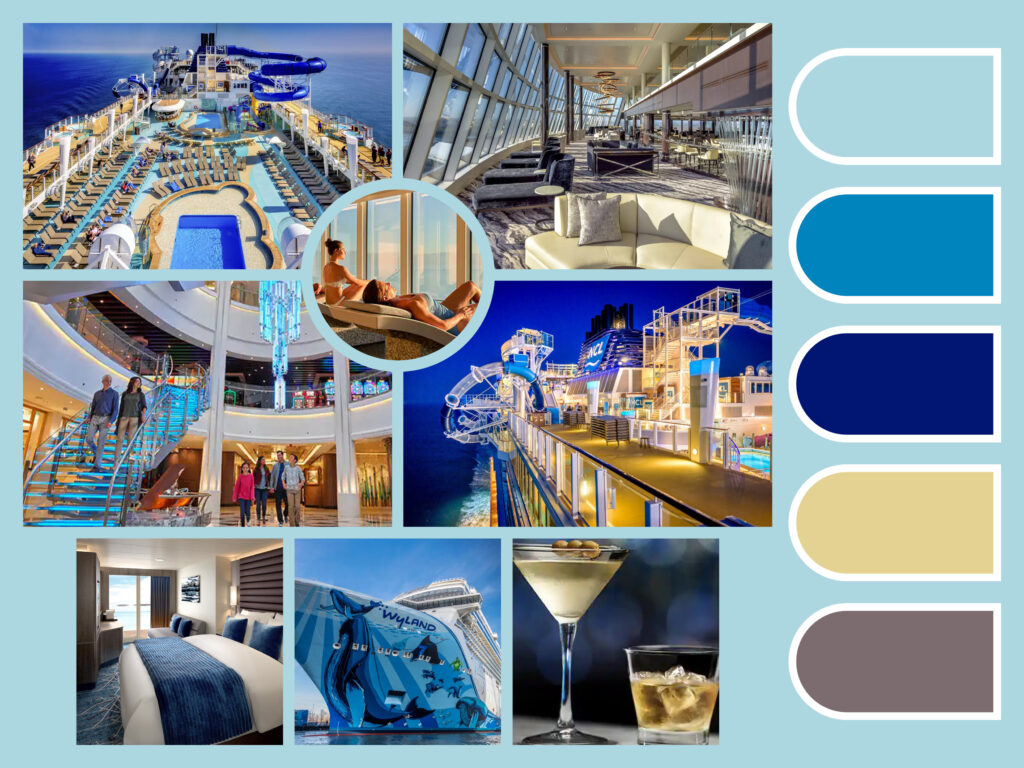
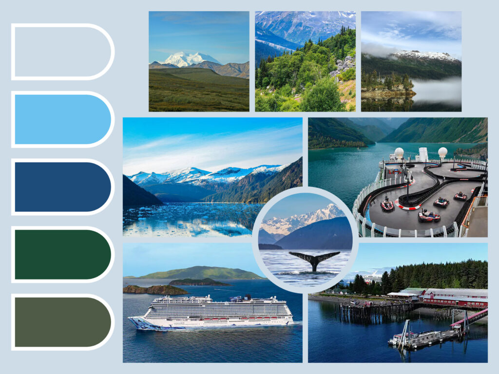
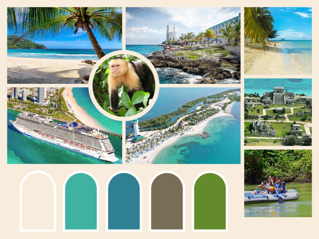
I started off my imagery exploration by created three mood boards. A mood board is a collage of artifacts, usually images, that share similar characteristics to define and communicate a particular identity. Designers frequently use them as inspiration and guidance for the visual direction of their projects.
I decided to center my mood boards around the cruise ship Norwegian Bliss by Norwegian Cruse Line given that I will be traveling on this wonder this December. I picked stock images from the NCL website as well as Google and Pinterest, all of which shared a similar color palette and theme. My first mood board is based on the color palette of their brand (various shades of blue) as well as colors that are found on the ship, such as gold and a very muted purple. My other two are based on destinations the NCL visits, including Alaska and the Caribbean. The Alaska mood board uses a cooler, more muted color palette to represent glaciers, mountains, and evergreen trees. On the other hand, the Caribbean one uses a more vibrant color palette to represent the beach, palm trees, and turquoise seas.
Trifold Brochure
Next, I decided to expand on my research and continue creating for the Norwegian Bliss through an informative trifold brochure. I decided to use a color palette and fonts that are similar to what is found on the NCL website. I created the layout and content of the brochure in InDesign, with my main goal being to capture what The Norwegian Bliss is, what amenities and activities she offers, and where she takes the traveler to. The visually compelling images used throughout the brochure (mostly stock photos found on their website), as well as the accompanying text, help to give a better understanding of the aforementioned as well as inspire people to look further into the ship—or even plan a vacation.
Reviewing the brochure as I type this, perhaps there should be less text and even more images. That being said, I tried my best to make the images the star of the brochure.
Product Labels
Finally, to showcase the impact of illustration, I was tasked to create (or redesign) labels for a particular product. I decided to redesign three labels of Plant Therapy essential oils. Although there is nothing wrong with the current designs (shown below), I decided to add more personality to them via digital illustration.

For my designs, I decided to focus on the front side of the wrap. After sketching some concepts, I created 2″ by 2″ labels (they would otherwise be 4″ by 2″ if I did the whole wrap) that fit on tiny 30mL amber-colored bottles. For my three versions, I did peppermint, lavender, and sweet orange essential oils. On each version, I added a watercolor brush effect to the background for calming “oily” aesthetics. I also illustrated the peppermint plant (tracing), the lavender plant (modifying an existing vector), and an orange slice (tracing) on their respective labels and added a white brush stroke effect to them.

Conclusion
This week’s exercise taught me the importance of carefully choosing imagery to represent brands. Image, be it photographs or illustrations, can make or break the mood in a body of work. Therefore, it is important that each image you use in your work has a clear purpose, is supported by research, and that you thoroughly plan out your ideas before submitting anything.


