
“Go with the flow” is a common mantra that many people apply to their daily lives. And in UX Design, it’s not much different when it comes to understanding users.
In the UX world, it’s no secret that the most crucial key to success of any product is how thoroughly the designer understands the user. Because of this, designers often create mock users in the form of user personas or scenarios to help them brainstorm how users might interact with the product. Furthermore, the designer always tries to make sure these various users’ experiences with the product are the smoothest they can be, and this is especially true for application design.
But how exactly do we ‘map out’ these users’ individual journeys through a product? There’s certainly no linear path, even if a user’s needs are very specific.
User Flow
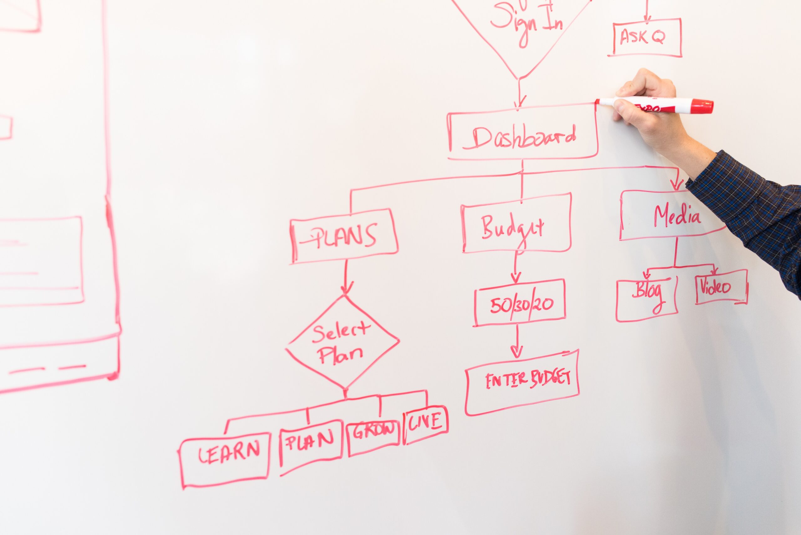
With the mantra still fresh in mind, one of the most powerful tools that designers use (or don’t use enough) to map out user goals is user flow, or a user flowchart. A user flowchart involves sketching out a diagram that has a clear starting point and a clear ending point (or multiple ones), with a series of actions, decisions, and other nodes in between.

If the ultimate goal for designing an application is to make individual experiences as seamless as possible based on well-defined problems, then it’s safe to say that we are trying to get users to enter that ‘flow state’ via an intuitive interface to reach their goals. And flowcharts help us do just that.
We don’t want users to be wasting their time sifting through clunky features or a confusing navigation system—essentially a battle with the product itself—in order to reach just one step toward their goals. But with flowcharts, we are able to create and see well-defined user actions which should aid us in making that smooth, intuitive application that will save everyone from headaches.
About My User Flow Exercise
Last week, I shared how I created the Information Architecture (IA) for a hypothetical companion app to help users access features and information from the North Country Chamber of Commerce website (more information about the North Country here). Now, I am taking this app idea even further by creating multiple user scenarios and making flowcharts for each. These user scenarios and flowcharts should definitely give me ideas on how to improve user interactions with the application, if one were to be made.
MyGoNorth Companion App
In last week’s blog post, I mentioned that my companion app would give users access to important features and information from the NCCOC website, but in the process I removed some content that I thought were unnecessary for the app. But, after some feedback I decided to actually expand on the app rather than remove content in attempt to ‘simplify’ it. The goal is still for a seamless experience and clean interface, but the app will now target a wider audience by integrating content from the NCCOC website as well as the MyGoNorth website into a comprehensive MyGoNorth app experience (more information about both websites here).
To elaborate, the MyGoNorth companion app would be designed to help tourists, residents, chamber members, businesses, and development contractors alike learn more about what goes on in the North Country and get more involved. Everything one needs to access concerning North Country business will be conveniently available in one’s pocket!
For each user scenario and its respective flowcharts, I decided to target a visitor, resident, and business owner. Here is the tourist’s story and scenario.
Mary: The Tourist
Mary loves traveling and the great outdoors. But she wishes to visit somewhere different and more remote, especially since she enjoys activities such as hiking, biking, fishing, and sightseeing. A friend told her about the North Country and she really wants to check it out, but doesn’t know much more about the area beyond that conversation. She hopes to be able to see what activities are offered in the North Country as well as find good dining, lodging, shopping, and activity locations.
Mary’s story can be summarized by a short but descriptive statement with a well-defined user goal:
As a new visitor to the North Country, I want to know what there is to do and what (and where) the good destinations are so that I can plan my trip, contribute to the local economy, and have a blast.
As you can see in the flowchart below, there are distinct elements that help define Mary’s journey. The element key is as follows:
- Rounded Rectangle (brown): start and end points
- Rectangle (blue): user actions
- Diamond (green): user decisions
There are many more distinct elements used in flowcharts, but these are easily the most widely used. Also, the arrows are important because they define the direction(s) a user would take after completing an action or making a decision.

In a Nutshell
Creating user flowcharts is not as easy as it may seem because one has to factor in every action a user could take depending on the site’s IA. Defining the end points was the biggest challenge for me because I was indecisive on where a user journey would actually end—or in other words, when a user would actually achieve the goal. I probably need to refine my flowcharts and IA some more, but I believe this is a starting point for something greater in improving user experience.
To explore the other two user scenarios and their respective flowcharts, view the full PDF below.