
Have you ever stopped and looked in awe at an appealing logo and think “wow, what a really cool look” as it captivates you? Let’s name a few popular brands: McDonald’s, Coca-Cola, Google, Disney, just to name a few. What makes these brands’ logos very recognizable is that not only are the graphics eye-catching, but the logos also take advantage of effective typography.
In a nutshell, typography is the art of arranging letters and text in ways that make the copy “legible, clear, and visually appealing to the reader.” It has been a fundamental component in UI Design since humans were able to put words on materials—long before technology enabled us to make designs and quick adjustments on computers. Going back to our brand examples, with Disney’s whimsical typeface, it feels like you are transported to a magical fantasy world. And, with McDonald’s huge golden arch along with the bold ‘McDonald’s’ letters, your attention is quickly captured and you are drawn towards their establishment. All in all, typography is everywhere, and is able to evoke certain moods among the viewers.
My Typography Exercises
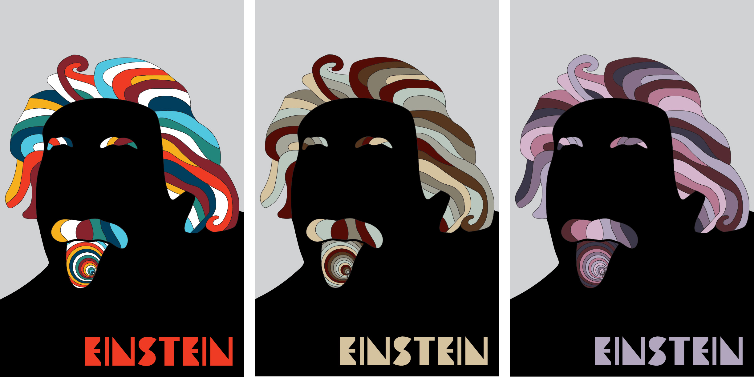
To get a better understanding of typography’s impact on everyday life, this week I underwent a series of exercises involving typeface research and design. I started off playing with typography by choosing six random nouns and then assigning descriptors to each of them. For example, noise would be: loud, brash, rude, overbearing, and nostalgia would be: retro, neon, silly, sentimental. I then browsed fonts and typefaces and made three mood variations that attempt to describe each of my nouns. Below, notice how each noun and its variations tell a different story and set a different mood from the typeface alone. For some of them, I added color and special effects to enhance the typefaces.


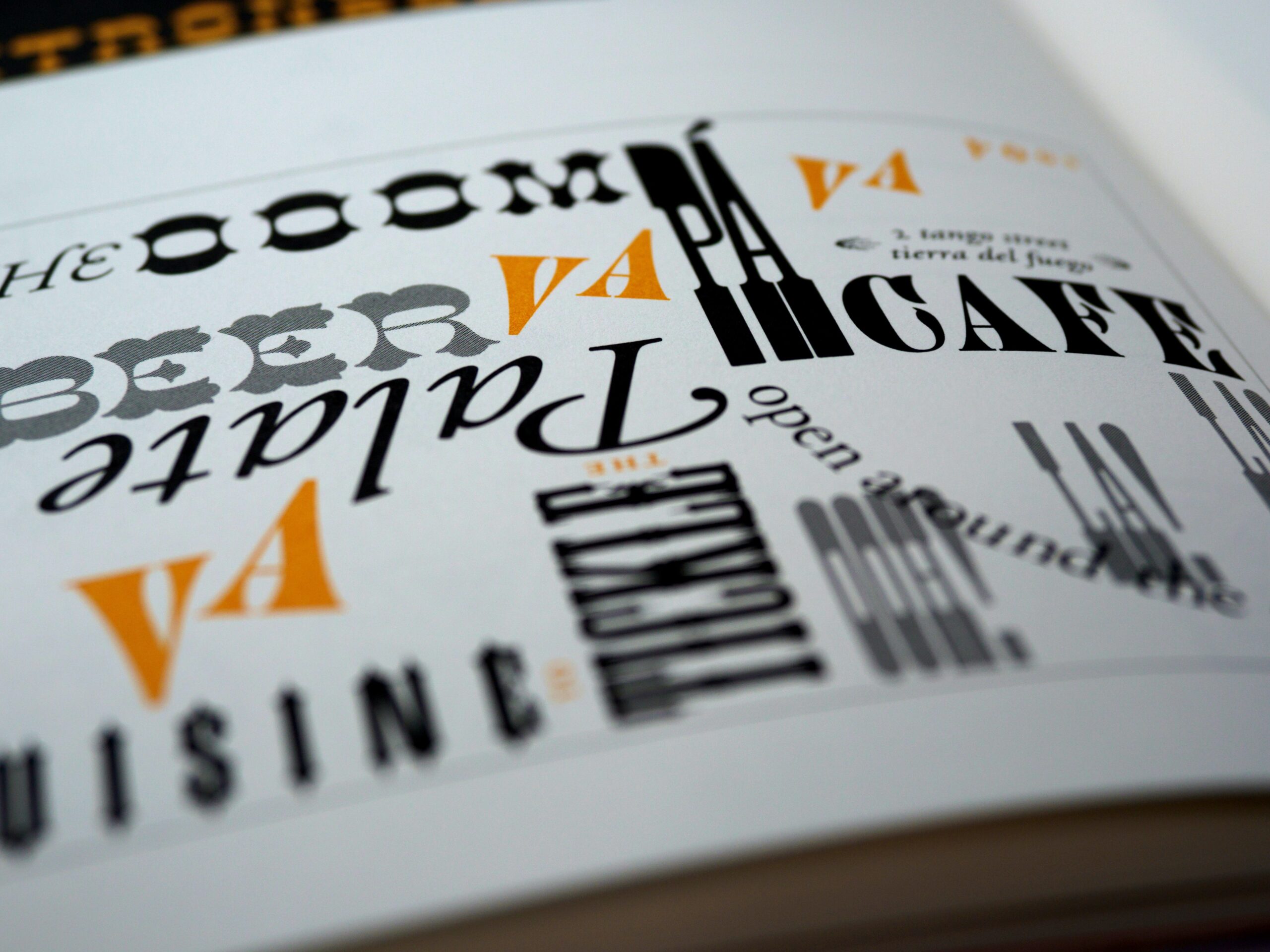
Moving forward, I also chose a font and created a type specimen poster for it. A type specimen displays the range and function of a typeface and its font variations. Here, I chose a typeface that is described as the offspring of Erbar and Futura: Avenir. Although there are geometric elements to this typeface, it is slightly not so. Therefore, in my specimen poster I wanted to emphasize the subtleties that make Avenir not quite geometric, unlike its parent font Futura, which uses perfect geometric shapes. Additionally, I discovered that for the ‘O’ letter on Avenir Black, if the horizontal stroke is set to 1 inch, then the vertical stroke is approximately 0.88 inches. Whether that is a purposeful correlation to the typeface’s year of creation (1988) or just a coincidence remains a mystery, but I still found this to be a fascinating fact. Overall, I found this exercise to be the most fun because I was able to be eccentric with it.

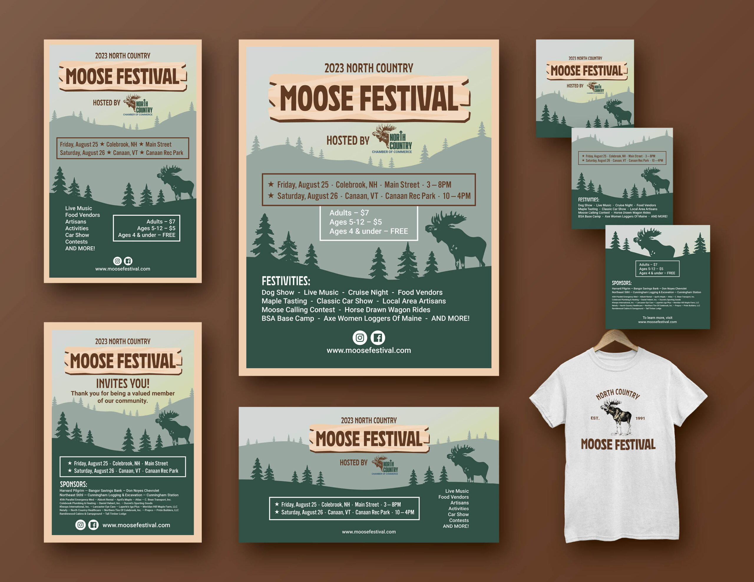
Finally, I applied what I learned about typography to building on my brand identity exercise from last week. I created an identity system for my chosen business through creating mockups of various promotional items. I used variations of the logo in each of the designs to establish specific moods as well as to incorporate the type in the most effective and pragmatic manner. Here, I have a mockup of a business card, a tote bag, a ballpoint pen, and a mug—all promotional items commonly used in small businesses.


Final Thoughts
Overall, I learned this week that typography is a very powerful tool that is not always recognized on the surface. It can make or break the mood when used effectively (or not so effectively). And, if utilized to the greatest success, that mood evoked among the audience will be timeless.