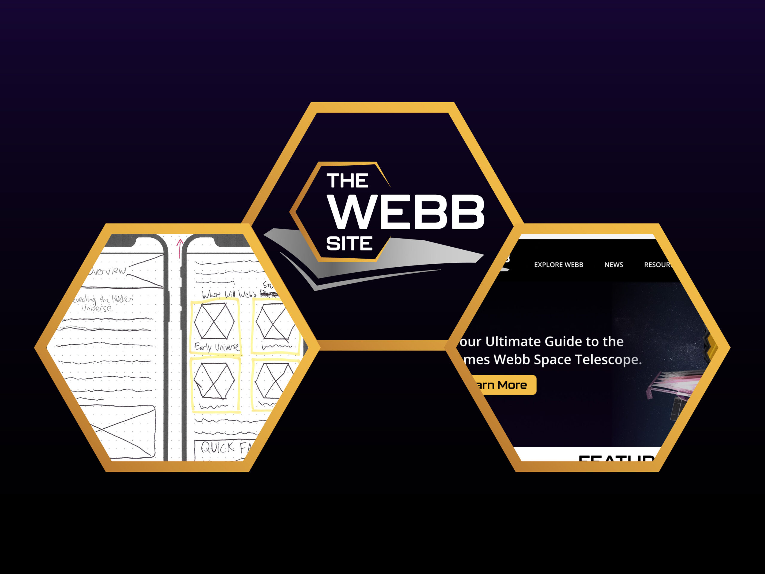
Last week, I was finishing up my paper wireframes, creating a brand identity with logo design, and researching/practicing the prototyping software Figma—all in preparation for creating a presentable body of work through a high-fidelity website prototype. This week meant business with referring to my information architecture and paper wireframes to grind and put together (most of) my high-fidelity screens in Figma. Overall, based on the successes and struggles I faced, this week was a huge learning experience for me regarding not only software and design skills, but also time management and self-discipline ones.
Why Prototypes?
If you are designing any product— be it a physical, technological, or application-based—it’s almost common law that you would need to conduct an experiment before releasing your product to the world. This way, you are able to test, reassess, and improve on your ideas in a systematic manner. Also, research that is conducted during the early stages of the Design Thinking process does not tell you everything you need to know for creating the best solution. In a way, prototyping is another (crucial) form of research that involves “exploring problem areas in interfaces, products or services” as well as “spotting areas for improvement or innovation.”
Using Figma to Make My Screens
Ideally, professional designers should always get other users to test their prototypes, and this was in my initial project plan. However, due to time constraints, I had to omit this step. However, this doesn’t mean that I wasn’t testing and reassessing my ideas while designing.
Based on last week, I had my ideas from my paper wireframes and information architecture, had developed my brand identity including important UI elements such as color schemes and fonts, and had researched and learned Figma… or so I thought.
Where I struggled the most this week was getting into the most optimal workflow, despite prior research. What I learned is that there is a significant gap between researching a software beforehand and then actually trying to implement my ideas through said software. Along the way of designing, I encountered problem after problem and was constantly trying to find solutions and workarounds as I went. In some instances, designing an interaction took much longer than expected. In other instances, I could not fully implement an idea due to software limitations.
For example, creating the navigation system with all hover triggers for the desktop site alone took several hours to complete for optimal performance. I could have omitted the hover triggers at this rate, but that would result in a clunky and incomplete navigation menu that is on the header on all screens. Hence, I found it necessary to continue.

Furthermore, Figma does not yet have a simple way to create expandable lists (which is a core part of my FAQ section). My workaround through research, though, was to create and nest auto-layouts for each possible scenario within a section and then set them as component variants that can be identified for prototyping. The setback is that this method still does not push the rest of the page content down; it only creates the illusion of pushing whatever is in the component depending on what I make in each component variant.

Additionally, last week I talked about how the mobile-first design approach is the most popular one in UX design. But once again, time constraints provided me with limitations, causing me to work on both mobile and desktop screens at the same time.
Moving Forward
I did not quite accomplish as much as I wanted to this week due to setbacks, and time was my biggest enemy. All that being said, I am proud of what I put together so far as a first-time Figma user (the experience with prototyping with Adobe XD helped out a little). Also, I believe I’ve familiarized myself with Figma’s auto-layout feature enough so that the remaining screens should not take nearly as long. Overall, I would say that I am in an okay spot for next week’s tasks: finishing my screens and interactions, inserting content, creating my walkthrough video, and finalizing my project. It all comes down to time management, namely reserving extra time for accommodating potential roadblocks.