
Imagine that you are in a UX design career and after gathering research and defining user problems, you are tasked to create a prototype of a new app for the company. But instead of being assigned to a computer and a specific software, you are given a bunch of office supplies: paper, pens, highlighters, scissors, glue, post-it notes, the list goes on. You then start thinking: how the heck am I supposed to build a prototype for an electronic service without electronics?
Well, surprisingly, it’s not impossible. And not only that, but prototyping using physical, non-electronic methods is actually a preferred first step for building an application prototype before heading to the computer software. Sometimes, it’s better to start with nothing but the basics and your imagination.
What Is Paper Prototyping and Why is it Useful?
In a nutshell, prototyping is creating a reduced ‘beta’ version of a product before its official release. Therefore, paper prototyping is creating an even more reduced ‘alpha’ version of the product by using paper and other physical tools.
So why use paper prototyping when you could just hop on digital software and start building it right away? Let’s look at some of the many benefits and advantages paper prototyping has over digital prototyping:
- You and your colleagues don’t need to be experts. No one needs to be talented in any computer or design software to use office supplies and to sketch. People have been using most of these tools since elementary school anyway.
- Anyone can join the conversation. Without that software and virtual barrier, your colleagues can much more easily see what your vision is and add their own input. More people are on the same page this way.
- You receive more inspiration for the digital. With the imaginative freedom of a pen and paper, you can visualize user flow and app interfaces in ways that might have been more difficult had you jumped right to the software first. You can even directly use your paper prototypes in the digital realm by uploading the paper ones to your software and tracing over them or using software such as POP.
- It’s much more time-efficient. With your ideas in the physical world for anyone to see and add to, you are potentially saving yourself a number of unproductive meetings and time managing a software.
There is no singular way to build a paper prototype; it’s up to the designer and their imagination to use the tools however they see fit to effectively convey their vision. I am about to show you how I approached a paper prototype of my own.
My Paper Prototyping Exercise
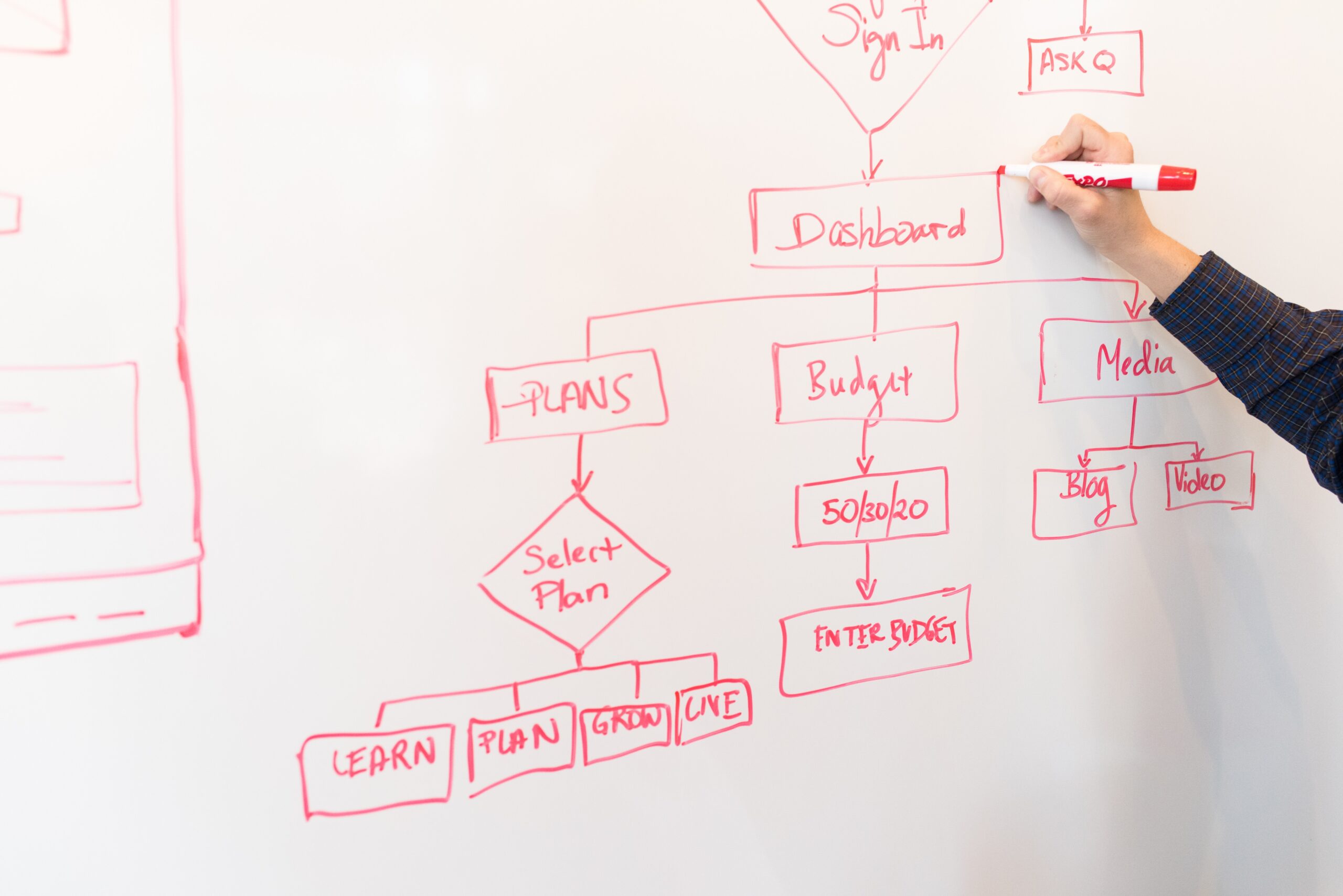
Now that we have an idea of how useful paper prototyping can be, it was time this week for me to put paper prototyping to the test. Over the past few weeks, I have been reviewing the North Country Chamber of Commerce website (I currently work for them) and brainstorming how I could make it better via a companion app. Below is my first iteration of the information architecture for said app.

Just last week, I discussed the importance of user flowcharts and used them to assist in the creation of the companion app prototype. Additionally, I decided that I should integrate the Chamber website with its sibling website MyGoNorth—which serves a wider tourist audience—and create a MyGoNorth companion app with content from both sites.

Now, with the revised information architecture plus the flowcharts and user scenarios I have created my first paper prototype for the proposed companion app (and my first paper prototype ever).
Methodologies
First of all, I decided to structure the app around five footer tabs:
- Home page
- Search engine
- Calendar
- Quick Access
- Navigation Menu
My motivations for these tabs were that the user would:
- View the home page upon opening the app and the latest information would be available on there, with links to other parts of the app’s architecture.
- Use the search engine to search for anything on the site using keywords.
- Use the calendar to view events and set reminders
- Use the Quick Access to ‘quickly access’ important links
- Use the navigation menu to access links via category dropdowns

Next, I created a key that should help people see my ideas. Using a couple of highlighters, some post-it notes, and my handy pen, I came up with what is shown to the right.
As you can see, elements highlighted in orange denote what the user can interact with, while elements highlighted in green denote what the user is about to click on when I demonstrate a user action. I also decided to use back and forward arrows that should come in handy no matter which footer tab the user is on (I also plan to actually implement them in the interface).
For my screens, I decided to give a preview of all five footer tabs and their main functions. Additionally, based on last week’s user scenarios and flowcharts I decided to incorporate three common user actions/goals into my prototype by sketching all the screens that would help users achieve them. These goals are:
- Finding things to do (as a visitor or resident)
- Getting more involved (as a resident)
- Becoming a chamber member (as a business or organization)

Keep in mind that each task can be performed in more than one way. For example, I pointed out that the link to subscribe to the newsletter can be found in Quick Access as well as on the home page and under ‘About the Area’ in the Navigation Menu tab.
To see all my screens and processes behind each footer tab and user goal, view the full PDF below.