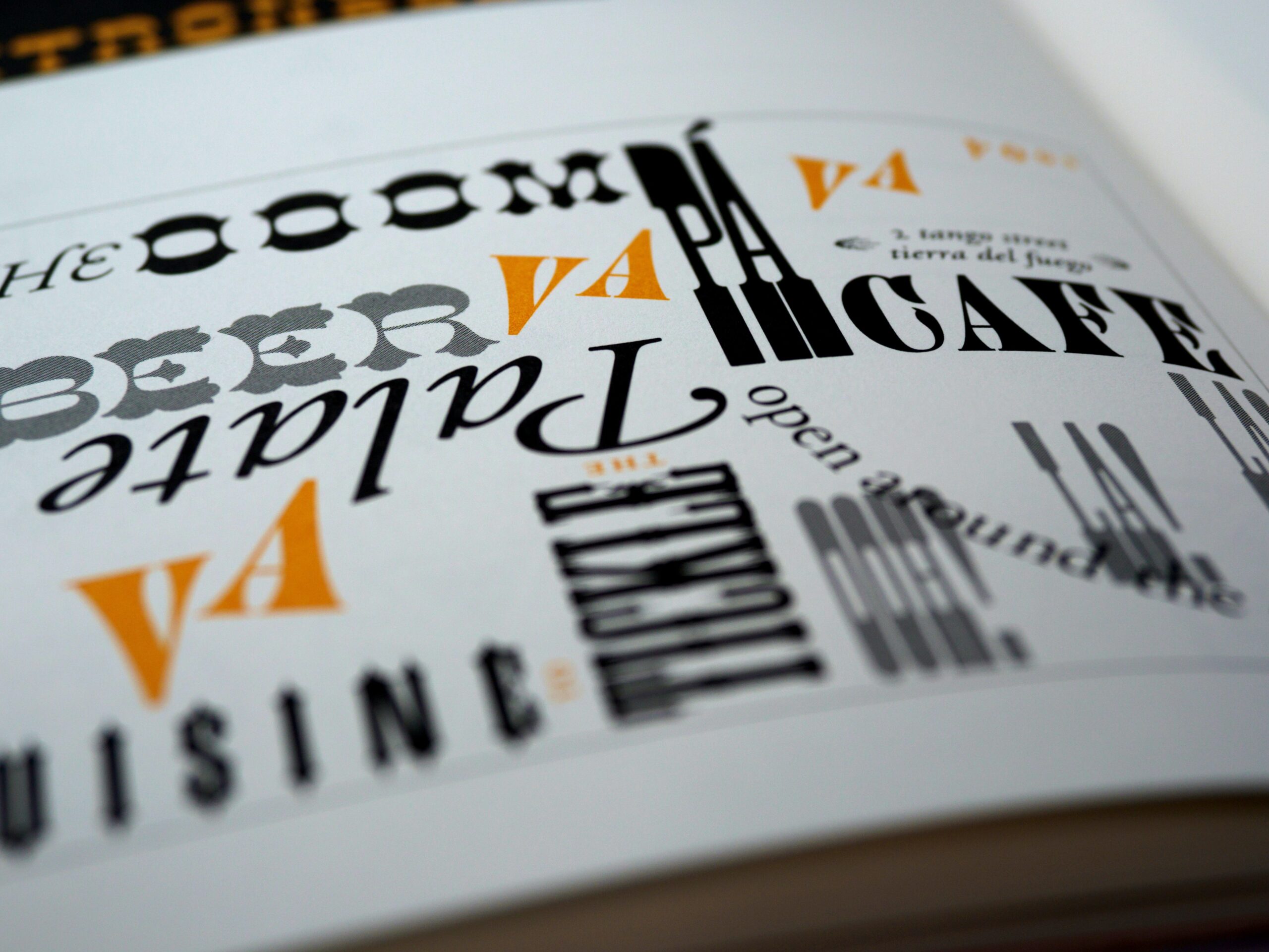

When people think of art and design, they usually think of eye-catching graphics, imagery, illustrations, and photography with the usage of principles such as color, texture, and typeface. But what is just as equally important for any body of work to be effective is composition; that is, the way the elements are put together. There is a good reason why it is fundamental in graphic and user interface (UI) design. When you observe something, your mind is subconsciously looking for balance and flow in the elements regardless of whether that’s your intention. A lack of balance and flow can leave the observer feeling uncomfortable or even frustrated, but once that is achieved, the observer feels satisfied and may take interest in the content.
Think of an email newsletter or a web homepage, for example (the artifacts for my exercise this week). It can take one messy, incoherent and overcrowded layout for you to unsubscribe from the newsletter or to never visit that website again. After all, there are competing companies with their own websites and perhaps their newsletters in your inbox.
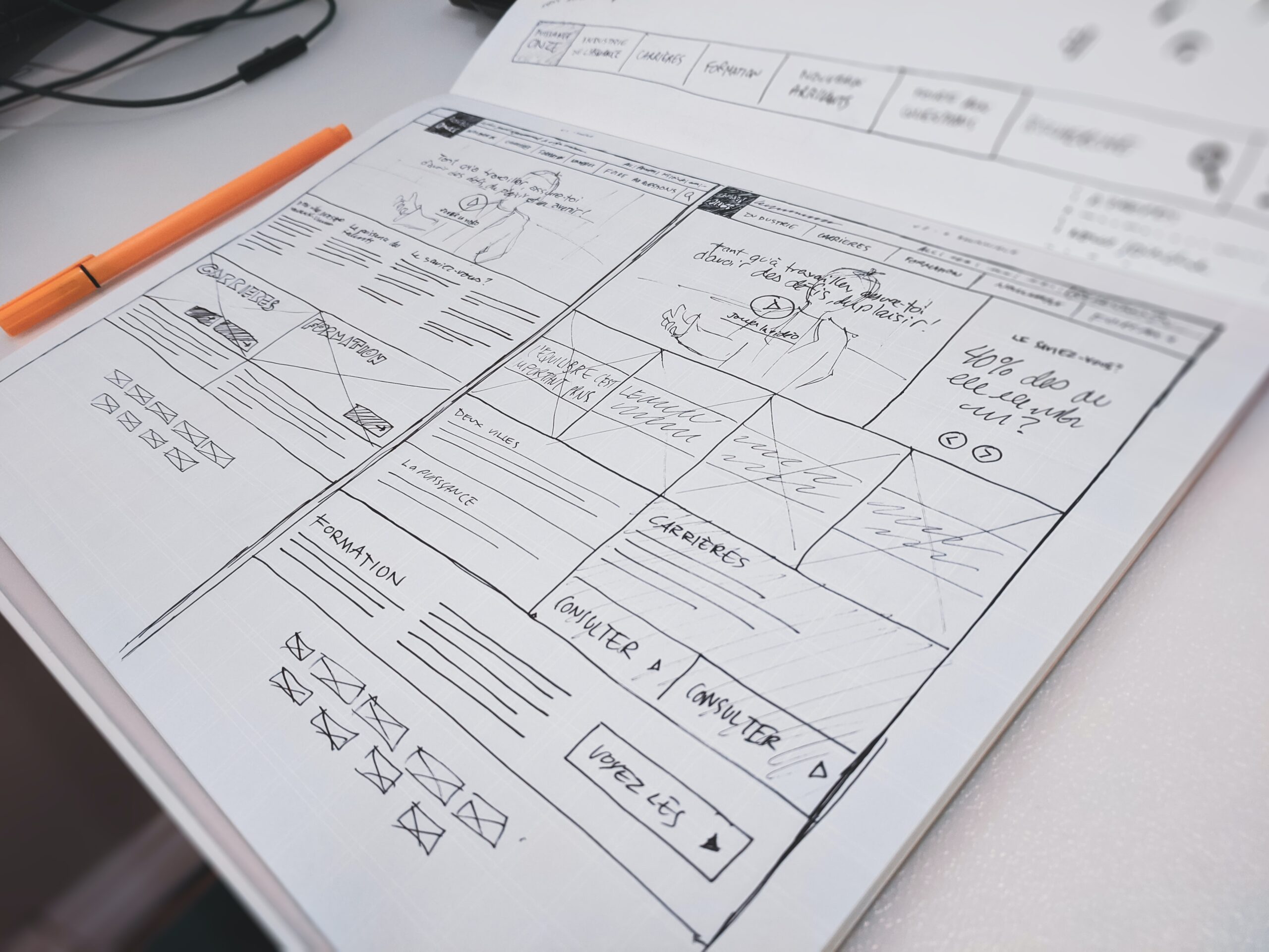
So how do we achieve good composition? There is no simple answer to this, for it depends on the content, and the amount of it, that you want to show. But the most important place to start is to make wireframes of your designs. You have probably heard of them if you are familiar with UX and UI design. But in a nutshell, wireframes are rough skeletons of your body of work which allow you to focus solely on where your information is going to go and how it is going to be displayed and organized, after you have done your research and have a sense of what your users need. Adding colors, written content, images, and other elements come afterwards.
A good tip on building your layout in your wireframes is to research and use grid systems, which are series of horizontal and vertical lines. In some layouts, the grid structure looks obvious (think of a 2-column grid); in others, they are more subtle or unorthodox (mix and matching composite grids). Nonetheless, grid systems are the backbone of effective layouts and should always be used in one form or another.
Email Newsletter
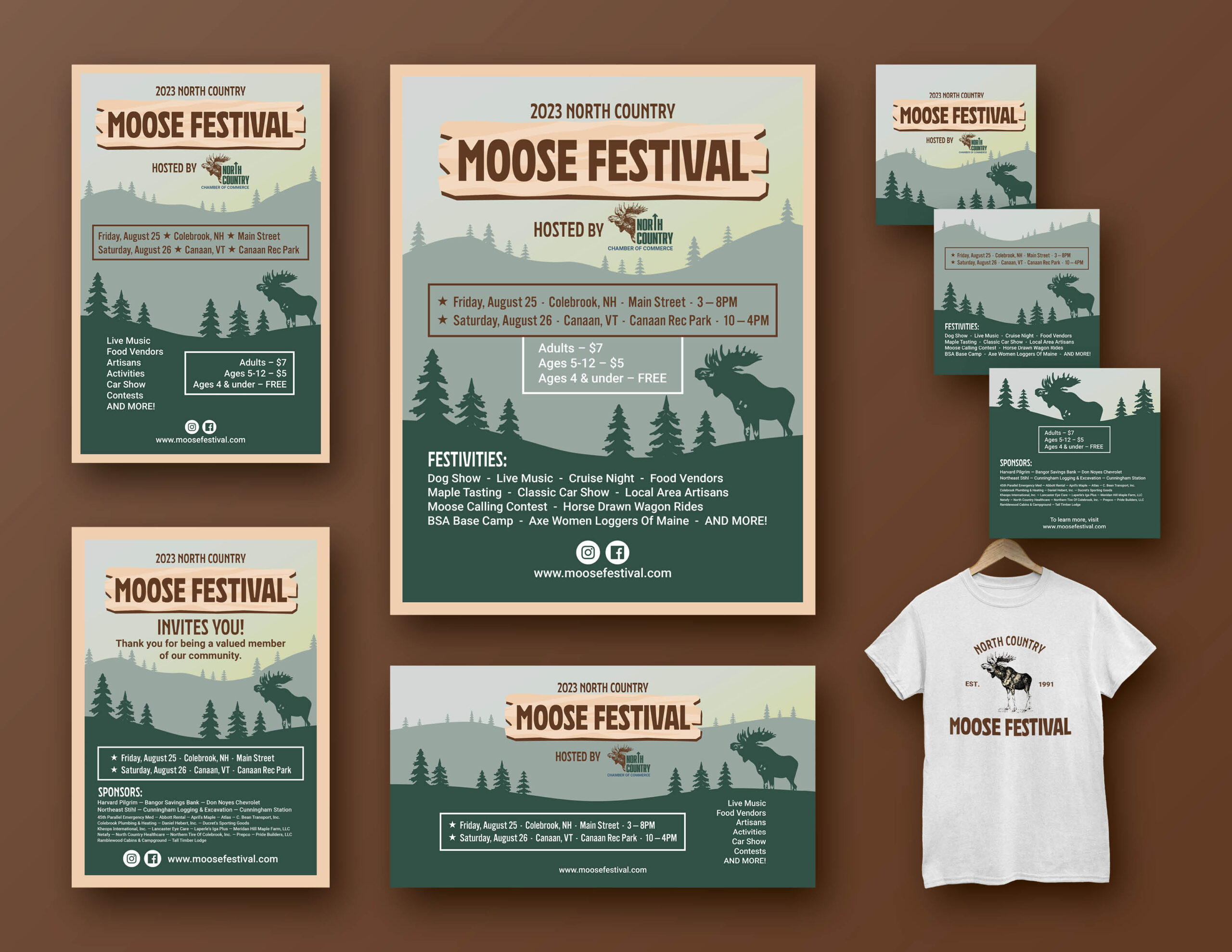
For part one of this week’s exercise, I created a mockup of an email newsletter using Illustrator, starting with the wireframe which focused on composition and layout, and then filling in the content for the more complete mockup. I decided to create the mockup for the North Country Chamber of Commerce, where I work. Although they have just started to issue more effective newsletters, I wanted to use their content to really practice what I learned and focus on the composition, taking it in a different direction.
Normally, email newsletters should not be crowded with text and should only provide catchy precursor information along with call-to-action buttons for the user to learn more about the topics. These should be balanced with images and white space.
For my mockup, I started with the logo and title followed by the featured story (an upcoming big event). I then made a ‘Recent News’ section with article thumbnails, headlines, and the first few lines of the written content. I then provided a ‘Things To Do This Season’ section for tourists and locals looking for activities. Finally, at the bottom I provided social media links, the address, and the option to unsubscribe.


Website Homepage
To go along with the newsletter, I decided to redesign the homepage of their affiliate website MyGoNorth using the wireframe and prototype software Figma. While the current site isn’t the worst, my goal here was to make it feel more simplistic while keeping most of the original content and experimenting with different grid systems. Once again, I started with the wireframe and then filled in the content for a more complete mockup.
I simplified the header by moving the social media links to the footer (perhaps they don’t need to be at the top of every page). I then made the hero banner cleaner by adding an opacity filter to the left side of the image so that there is more contrast with the text. For the Featured News section, I made a simple four-column grid and moved the titles and teaser text below the square images rather than over them. I did the same for the Pick a Season section with rectangular images. Next, I decided to bend the rules a bit and turned the Things To Do section into a carousel slider, which allows the user to scroll horizontally through the content (that is, the different activities offered in the summer). I also made sure that there were plenty of call-to-action buttons that allow the user to learn more and visit other parts of the site.


Conclusion
Effective UI design is not easy, but if you take the time to be conscious about the composition of your work by researching layouts, grid systems, and wireframe elements, you can turn a disorganized mess of ideas into a visually pleasing body of work. By doing so, you would actually be saving time and preventing headaches in the long run, for yourself as well as your clients.