When promoting a large event, there is a wide a variety of materials to be made in order to advertise said event and draw people in. This ranges from print materials such as posters, flyers, and invitations to social media ads such as Facebook thumbnails, Facebook cover, and Instagram posts. Not only do you need good visual elements, but those elements also need to be displayed and arranged appropriately on every material, and understanding good layout design is the key to maximizing their effectiveness.
One crucial principle of effective layout design is utilizing white space. White space, or negative space, is the empty space around and through the elements of your design. Not only does white space help your design breathe, but it can also actually make certain elements stand out. If there is too little of it, then your design may appear cluttered, confusing, and even unprofessional. Therefore, make that empty space your friend, not your enemy.
Once you have researched the dimensions of your materials and identified which elements are necessary to put on them, you should start figuring out how you are going to utilize white space within your designs. There are many tips for this, such as increasing margin sizes, increasing text parameters such as leading (space between lines) and kerning (space between individual characters), and making sure there’s ample room between your elements. It’s a good idea to do some sketching first so that you can better visualize your layout.
Of course, you should also be mindful of other principles such as visual hierarchy, contrast, the rule of thirds, the size and weight of your text. All of these principles along with effective white space come together to create good layout design.
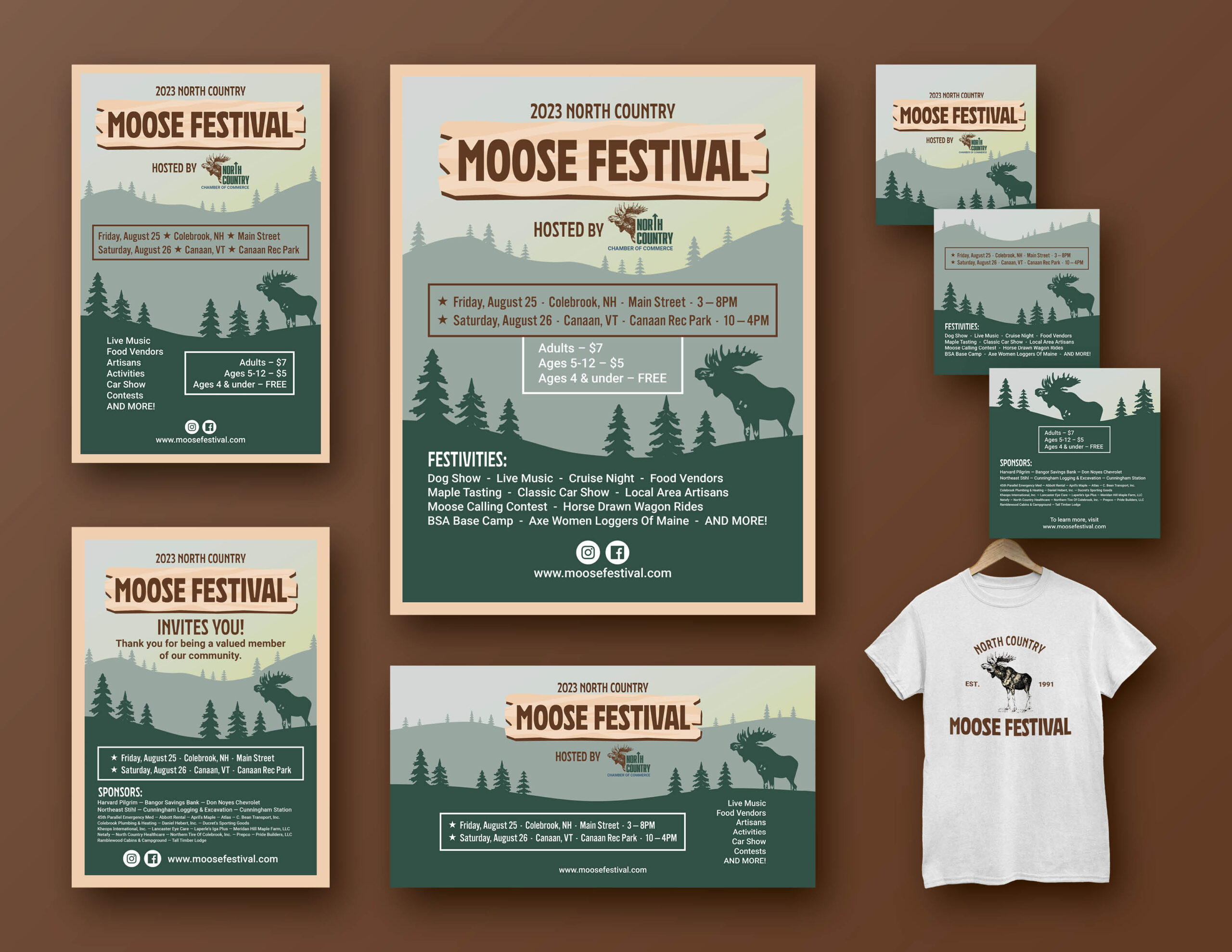
For this week’s exercise, my challenge was to create my own package of materials for a particular event. The event I chose was the North Country Moose Festival, which is hosted by the North Country Chamber of Commerce and has taken place in Northern New Hampshire and Vermont every late August since 1991. I have already designed materials for the Moose Festival before (I am currently a working for their Chamber board), with this being my current 11×17 poster design.
Although this design was well-received by the board and went forward for use this year, after learning about more nuanced layout principles this week, I feel that it could be improved upon, especially when it comes to white space (there is not much of it). Therefore, I wanted to take the opportunity to give it a completely new look based on what I have learned and apply them to new materials and mockups.
The materials in the package for this exercise include:
- Flyer
- Poster
- Invitation card
- Facebook banner
- Facebook event thumbnail
- Instagram carousel of three images

I started by doing some very rough sketching of the poster so that I can visualize the illustrations, text, white space, and how everything should be placed. Of course, I would be including and modifying different elements for each material depending on the context.
Flyer & Poster
For all of the print materials, I decided to add a frame border to convey a portrait-like aesthetic, given that the background resembles the rural New Hampshire landscape. As long as the border is modest and not distracting, it can give the design a more sophisticated feel.
Because flyers are typically more informative than posters, I decided to include only a simplified festivities list on the poster while adding the full, detailed list on the flyer.
Invitation
I figured that the invitation would be tailored to the sponsors for the festival as well as members of the area’s Chamber of Commerce (many are both). Therefore, in addition to the brief invitation message, I found it necessary to include the sponsors list, along with the date/location/time section.
Social Media Ads
These three materials here are covered for the social media ads:
- Facebook cover banner
- Facebook event thumbnail
- Instagram carousel of 3 promotional posts
Normally, Facebook cover banners don’t contain much information besides the most important details. Therefore, I wanted to keep it simple by stretching out the background design and including only some of the festivities in addition to the date/location/time in order to evenly distribute the negative space.
Furthermore, I made the content on Facebook event thumbnail similar to the cover banner in that it only contains the basic, important information, and also the link to the website.


For the Instagram promotion carousel, I had the freedom to distribute all the important content among the three posts: the logo, the date/location/time, the festivities list, the pricing, and the sponsors list. Each post in the carousel has a modified background (i.e. color choice, placement of mountains, moose, trees, etc.).
T-Shirt Design
As this is a common design choice for event t-shirts, I decided to keep the front side simple with just one object placed on the upper-right, and then the back side having the full event logo. In this case, the front object is the North Country moose drawing/logo, which is used on most materials for the North Country Chamber of Commerce. Meanwhile, the back side, which has the main event logo, incorporates the North Country moose drawing, along with simple but impactful words “North Country Moose Festival” as well as the year of establishment.
Conclusion
Overall, I learned just how much a layout design can change depending on which material and format it is. For big materials such as the poster and Facebook banner, implementing white space was much easier, especially given that there were less elements to work with among a larger space. Also, context matters as to deciding which elements are gong to be included in each material and why. Is the material more informative (more text)? Or is visual appeal the top priority (more imagery)? These are questions that every event designer must answer in order to make the layouts of their materials the best they can be.


