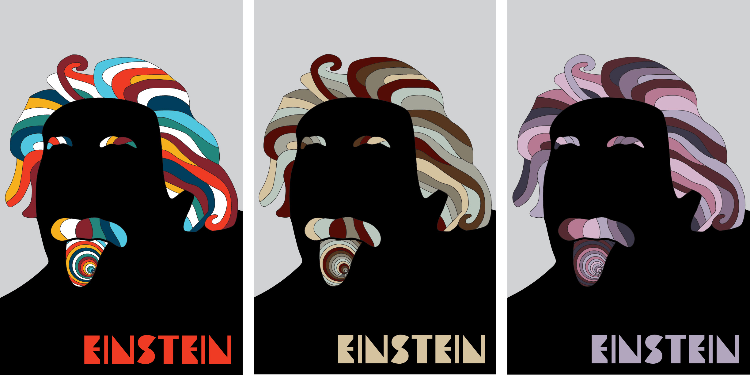
In literal terms, color is defined as the electromagnetic radiation of a range of wavelengths that are visible to the human eye. This means that when we see something, we are actually seeing that ‘thing’ reflecting light in various combinations of wavelengths. But these different wavelengths, which appear everywhere we look, have deeper psychological influences on us. When you see a cool color such as green or blue, you may feel calm. When you see bold red, you may feel alert. When you see a neutral color such as grey or brown, you may feel a sense of formality.
The reasons for feeling different things depending on what wavelength of light we see vary, from cultural and environmental influences to direct impacts on our brain. Regardless, people have been utilizing this phenomenon to influence others’ emotions and behaviors. This is especially true with brands and user interfaces, where designers utilize color psychology to convey a certain message or even influence decision-making among their audiences.
Let’s take a look at the psychology of some individual colors as well as some real-world examples of brands’ utilization of color psychology.
Color Psychology Applied
First of all, brands don’t just choose random colors for their materials; they carefully consider and choose each color to convey an identity that aligns with their goals. In fact, color scheme alone can actually make or break an identity. A simple call-to-action button can have different conversion rates by just changing its color, with a red one outperforming a green one by 21%. Therefore, companies must choose their colors wisely.
Red

Red is a powerful color that evokes a wide array of emotions. It is often associated with alertness, energy, love, and passion, which is likely why brands such as Target use it to attract customers and create an energizing atmosphere. Red can also be associated with negative feelings such as anger, danger, and violence, which is why we often see red used on warning labels. Therefore, red should be chosen carefully.
Orange

Like red, orange is a very energizing color, but is considered to be more friendly and inviting than red. This may be why it is successfully used by the children’s television network Nickelodeon. Given the aesthetic of autumn, orange is also associated with change and warmth. That being said, most companies use orange sparingly (or not at all) because it may appear as cheap and thus deter customers.
Yellow

Yellow is considered the most energizing color of the warm colors and is often associated with brightness and happiness, like the sun. When used alongside a darker color, yellow can be powerful. McDonald’s is a prime example of this, using yellow via their golden arch logo, usually along with a red background, to grab customers’ attention and attract them to the restaurant in a positive manner. Yellow can also be associated with deceit and cowardice.
Green

Green is considered to be one of the most relaxing colors. It is down-to-earth and is often associated with growth, health, stability, and abundance. Starbucks probably uses green to destress their customers and promote the feelings of abundance and stability in their coffee shop. Green can also be associated with envy or jealousy.
Blue

Like green, blue is a very relaxing color. It can promote calmness and responsibility, but also sadness. Dark blues are often associated with strength and reliability, which is why many corporations—especially tech ones like Facebook—use it in their brand identity. It is a relatively safe color choice, but can also be powerful when used in the right ways.
Purple

In ancient times, purple dye was extremely rare and expensive; therefore it was used almost exclusively by aristocrats. As a result, to this day purple is often associated with royalty, superiority, and prestige. It can also promote imagination and romance. Somewhat recently, Taco Bell changed the color of its bell logo to purple, probably to appear more extravagant.
Neutral Colors


Because neutral colors are more subtle, they are primarily used as backdrops to complement bolder colors. However, many companies use neutral colors on their own, such as those shown above. Blacker colors are considered more negative while whiter colors are considered more positive, but they don’t always have to be. They are also often associated with power, elegance, modernity, and cleanliness, which is why companies such as Apple and Nike use grey and black respectively in their logos. The brown M&M’s logo, besides the obvious chocolate, also promotes wholesomeness.
Conclusion
Although we may not always be consciously aware of it, the colors we see have the power to trigger certain emotions and behaviors. This is why companies hire designers and marketers with specific agendas in mind. They carefully utilize color psychology within their brand identities so that we, the consumers, not only feel certain emotions when looking at their logos but also are potentially driven to take action in their favor.


