
Milton Glaser was a well-respected graphic designer who produced many influential works, including the widely recognized “I (Heart) NY” logo. But one work that was especially mouth-dropping for its time was his Bob Dylan poster, where he supposedly took advantage of a vast color palette found in Persian miniatures.

The design choice is so fascinating that there are countless other versions that people made over the years, each with a different silhouette and a unique color palette. And as a tribute to Glaser’s work, this week I also partook in creating my own “glaserized” poster with three different color palettes.
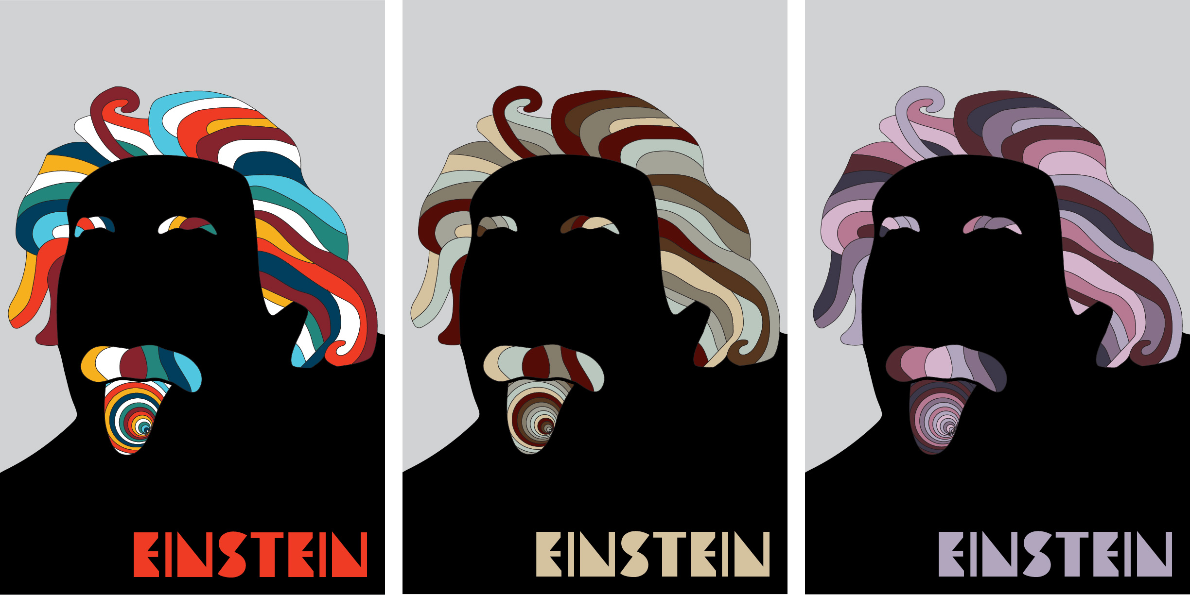
For my poster, I decided to go back even further in time and made a silhouette of the world-renowned physicist Albert Einstein. More specifically, I wanted to make a silhouette of this photo because I liked the juxtaposition of being professional and eccentric.

In Photoshop, I outlined his head and shoulders to make the silhouette. Then I brought it into Illustrator and designed the hair. I also decided to “galserize” his eyebrows, mustache, and tongue. Once I made the design, I then had to carefully decide on the three color palettes and then decide where all the colors would go.
My Process
When choosing my color palettes, I did not just choose any random color; I chose each one with purpose.

For my first palette, I wanted to work with complementary colors, especially reds/greens and oranges/blues like what is shown in the cosmic microwave background above. This image is evidence of the Big Bang Theory, which was theorized from Einstein’s Theory of General Relativity (even though he first tried to propose that the universe was static, which he called his “greatest blunder”).
That being said, putting exact opposite colors together can be “visually jarring” and create a vibration effect that can irritate the eye. Therefore, to ease the eye I decided to group the complementary colors via analogous hues: one set of warm colors and one set of cool colors. I also made sure that only some of the colors are exactly complementary to each other, while the others (namely the yellow and dark blue) served as transitional colors. Additionally, I left some hair strands uncolored (white) to ease the transition even more. Eventually, I came up with this palette of 6 colors plus white.

For my next color palette, I wanted to do something more literal and extract colors from a digitally colorized image of Einstein. I settled this one because the colors were neutral (minus the red shirt) and showed professionalism and prestige.

According to this article, red makes a good accent color and neutral colors are used to show sophistication. After spending some time figuring out how to properly distribute the neutral colors along with a hint of red, I eventually came up with this palette of 5 colors.

As a tribute to Einstein’s Atomic Theory which led to proof of the existence of atoms, I decided to extract the colors from this image Eagle Nebula, which is full of young stars being birthed by hydrogen gas (shown in red), which is the lightest element in the universe with an atomic number of 1.

This would produce an analogous red-violet palette that is somewhat soft and muted. I extracted 5 colors in total and produced this accordingly.

Conclusion
Creating my own version of Milton Glaser’s famous Bob Dylan poster turned out to be way more than throwing a bunch of random colors together; in fact, it took a while to choose which palettes I would go for and then which colors in each palette would make the cut. All in all, I wanted to evoke certain psychological responses in each of my posters, which is what color—a spectrum of light interacting with the human eye—is capable of doing.