Project Synopsis
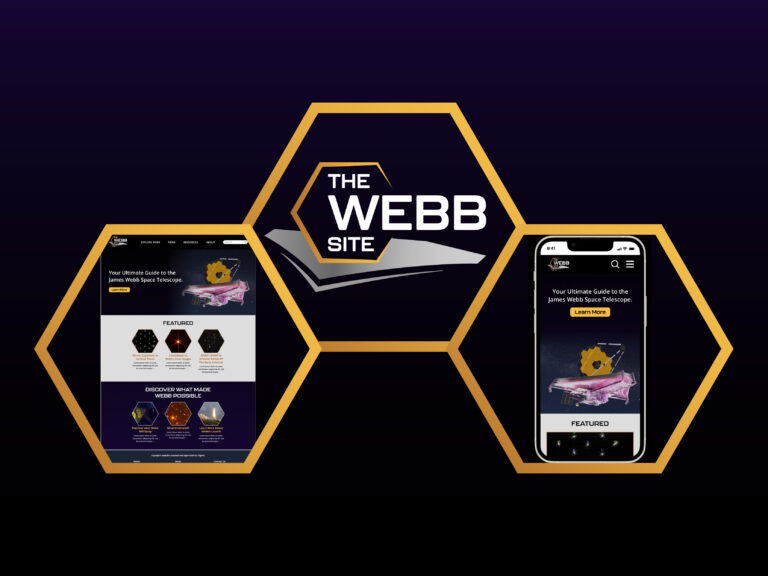
The Webb Site prototype project consists of a set of two prototypes: one for desktop screens, and one for mobile screens. It is intended to serve as a hub for information regarding the James Webb Space Telescope found on NASA’s plethora of different websites, which are somewhat disorganized and confusing to navigate. It is especially a redesign of the current JWST website. The main goals here were content organization and responsiveness across different screens.
The full process included: creating a proposal and project management plan, performing competitor analysis (in this case, it’s NASA’s current JWST website), formulating user personas, designing the information architecture, making wireframes for both desktop and mobile screens, designing the website logo, and then making the actual prototype.
You can interact with the prototypes and view the full case study below.


