This week I did some research on animation techniques from Blazer’s book Animated Storytelling and the web. Additionally, I created a logo stinger for promotional purposes.
Animation Techniques
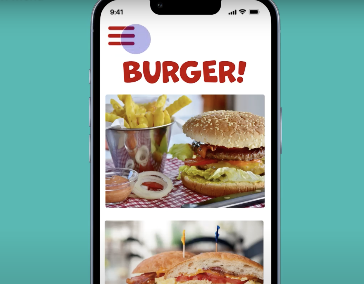
At this point in the animated storytelling journey, it is wise to research and decide on the best technique(s) for your animation. For this, the first thing everyone should consider is how your animation will be viewed. Is it intended for a big screen or a phone? Format is crucial. Most importantly, you will also want to choose a technique that best fits your story. This includes finding the right tools that translate your story’s message and mood.
So, what are these techniques and styles for consideration? Here, I compiled a list with explanations from Blazer’s book.
Hand Drawn: This technique involves using physical drawing materials such as pencil, paint, ink, or charcoal. This is great for television shows and children’s programming, with one prime example being traditional Disney films.
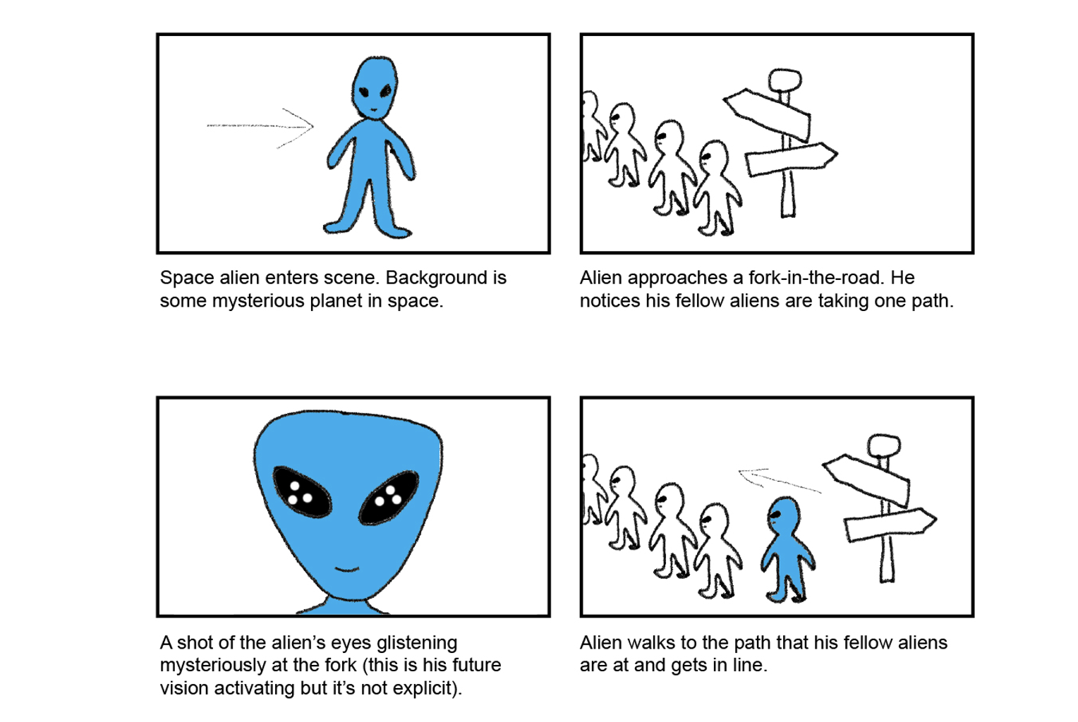
Stop Motion: Just as what I was working with last week, stop motion involves using a camera to shoot physical objects frame by frame as they move incrementally. It can be 2D or 3D, with 2D stop motion usually involving cutouts over a flat surface and 3D involving objects on a set.
2D CGI: This is created in some form of two-dimensional software environment and is often used to “lighten the tone of a heavy subject,” according to Blazer.
3D CGI: As with 2D CGI, this is created in a software environment, but with three-dimensional graphics. This technology allows people to create hyper-realistic worlds with added special effects.
Workarounds
Let’s say that you are not satisfied with the technique you chose because it does not fully fit how you wish to tell your story. There are workarounds that you can explore if you want to be flexible. Here are some from Blazer’s book:
Importing Still Images: This is actually a very common shortcut and allows you to get creative in editing software with tools such as masking and camera-panning to simulate real movement.
Shooting Live-Action Footage: Maybe you need something more than just still imagery. You can capture real actions using a video camera and then add effects to it in editing software.
Staffing Up: If you can’t get something done by yourself, you can always outsource it to someone else. If you can’t afford to pay someone, maybe ask a friend to volunteer, This way, you can find new talent and perhaps even new ideas for your story.
Whatever technique or workaround you choose, it is crucial that you the find the right one for you. Do not be afraid to experiment with new techniques and styles, so long as you are fully committing to something when it comes down to the final production.
Research to Inform
Here, I explored the twelve principles of animation (here’s a good video on it) and found some examples that I thought applied certain principles very well.
Anticipation: When thinking of anticipation in animation, my mind immediately went to the element-bending forms from one of my favorite childhood shows Avatar: The Last Airbender. There are countless examples throughout the show, but one that demonstrates it so well is lightning-bending, and the redirection of it. In this scene, when character Zuko was shot full of lightning from his father Ozai, he managed to redirect it back at him through a distinct dialing-back movement with his pointing two fingers. At that moment, the audience was anticipating whether he would be able to pull it off, which he did.
Squash & Stretch: This principle involves giving things a sense of weight and flexibility, and a good example that utilizes weight and flexibility is the Mario video game series. When he stomps on these brown creatures called Goombas, their entire bodies squeeze down and stretch out before they implode into coins or fall out of the bounds of the game. The 3D examples later on in this compilation video demonstrate this better.
Exaggeration: Spongebob Squarepants utilizes this principle to the fullest, but this scene is especially a good example. Here, Spongebob’s crying is expressed in many exaggerating forms such as his acting like a faucet, a paint roller, and a sprinkler, and then flooding the house with his tears.
Slow In & Slow Out: The classic cartoon Tom and Jerry demonstrates slow in and slow out motion pretty well. When Tom or Jerry runs, they never start running in constant motion; they always ease into the running motion and then ease out of it even when they’re trying to abruptly stop. When they crash into something, the reciprocating force is never constant; they ease away from the ‘thing’ they crash into. Even when they are falling, the viewers notice that there is an ease into the fall.
Appeal: A huge part of why Dr. Seuss’s How the Grinch Stole Christmas is one of the most iconic Christmas stories to this day is the appeal of the main character the Grinch. His iconic smile at timestamp 1:00, his climbing down the chimney, his pinching the candy canes away from the children at timestamp 1:47, and his walking around houses as he’s stealing things are just some of the many memorable characteristics of the Grinch.
My Logo Stinger
Here is my promotional logo stinger. Thankfully, about a month ago I had already updated my brand with a new logo and even made a catchphrase, so I had a vector file prepared to make an animation for. I just had to separate certain elements into distinct layers that I could directly use in After Effects, and that was the tricky part. Then, in order to animate the ‘LM’ letters in the logo I had to create a complex animating mask path, which took some time to try to make look right. I had to get a bit intuitive when changing a lot of the parameters I was working with because I had to make sure the animations looked smooth first and foremost. Finding the right sound effects that matched the mood I wanted was another challenge.
Overall, I enjoyed making this stinger despite all the technical challenges I faced in After Effects. I will probably go back and change some things with more time and assets, but for my first attempt at making a promotional logo stinger, I thought I did fairly well. Check it out below!


