
You have your preproduction work finished and finally got to the point where you are beginning to animate. That being said, there are still things that could hinder your workflow and progress toward your end goal. In Animated Storytelling, Blazer gives some tips (shown below) on how to tackle these potential challenges and make your animation process as smooth as possible.
Plan It Out
More specifically, create a production calendar and fill it in backwards. That is, start with inserting your final deadline on a blank calendar, and then work back through important post-production, production, and preproduction dates. And be sure that all your deadlines are realistically attainable and paired with realistic motivators.
Back Up Everything
When my screen suddenly broke on my Macbook and I didn’t back up my files, I thought I had lost everything. Thankfully, because it was an external issue and not an internal one, I was able to safely back everything up at the Apple store using an external monitor. However, others aren’t so lucky; sometimes that internal damage or a crash that causes your project file to be corrupted can make all your hard work disappear. So always save your work often, back up important assets, be sure to have plenty of space on your hard drives, and organize your files.
Start Easy and Build Up
Starting at the beginning of your story can be intimidating for a lot of people, especially for me who has ADHD and therefore already has difficulty working linearly. So, start at your project’s “lowest-hanging fruit” (the scene that is the most fun or easiest to animate). Then work on another sequence that is marginally harder, and so on and so forth.
Once you arrive at your most challenging scenes, break them up into smaller pieces, for those pieces have their own story arcs to them and therefore you can treat them as individual, less overwhelming arcs.
Reassess and Remove
Even though you technically established everything in preproduction, you should always continue asking yourself if a shot or sequence is absolutely worth it. If not, then cut it. If it’s too long, then make it shorter.
Map Out All Movement
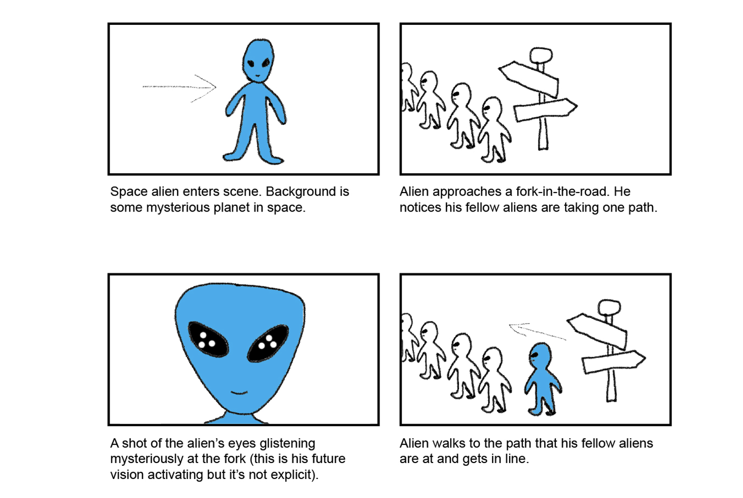
While your storyboard should have your key poses established, you could still run into logistical errors in the software when trying to fully animate something. Therefore, you should revisit those key poses, analyze each shot, and map out the “basic choreography” of your characters’/objects’ positions and movements, including all elements that will be in the final product
When mapping movement. be sure to pay attention to the laws of physics and reaction forces (e.g. leaning back before running, hair/clothing moving forward as the character stops) so that it doesn’t feel robotic. Also, it is helpful to chart the paths of your objects’ directional movements (horizontal, vertical, diagonal, circular).
Mix It Up
If your subjects remain in one specific position or too long, then the audience will start to lose interest. So, be sure to make the positions interesting by moving anything away from the dead center, mixing up their scaling, and vary the timing of your sequences.
How Does It Sound?
Sound is a crucial element in any animated storytelling, and you may have chosen your soundtrack way in advance and have it set in stone. But maybe it suddenly doesn’t eel right. In this case, consider being flexible with your sound. Perhaps swap tracks to view your animation with a fresher lens and affirm your original choice. It’s often helpful to let your soundtrack actually influence the animation of your sequences. Finally, mute your soundtrack to see how your animations stand on their own, and make adjustments if it’s too reliant on the sound.
Research
Moving on to UI Animation, here’s some examples that I believe demonstrate effective user interface motion.

This one demonstrates that a very simple function can have a fun, interactive animation. I really liked the confetti shapes that fly out when the options bar is revealed.
This one is rather simple but does the job well. When a menu item opens, the other items scrunch and adjust to the screen size, which makes the interface feel intuitive.

Here, a simple search function has been enhanced into a fun animation. I like how the search bar bounces and then the results flip into existence like a casino game.
The following examples don’t embed well, but the Dribble links should allow you to see the animations.
This mockup social media interface is loosely inspired by TikTok, but also includes its own mock features and elements. I think it is executed pretty well, especially with the ‘For You’ page being a hybrid of scroll and swipe-up UX.
This is just a very smooth interface with a lot of ease-in transitions. I really liked the animation of the progress bar when a new widget was added. The streaming service interface also felt very intuitive.
This digital card app interface was very fun to watch. I really liked the swapping animation between the cards, and the flip-and-spin animations for the color choice menu was very complex yet intuitive.
My UI Animation
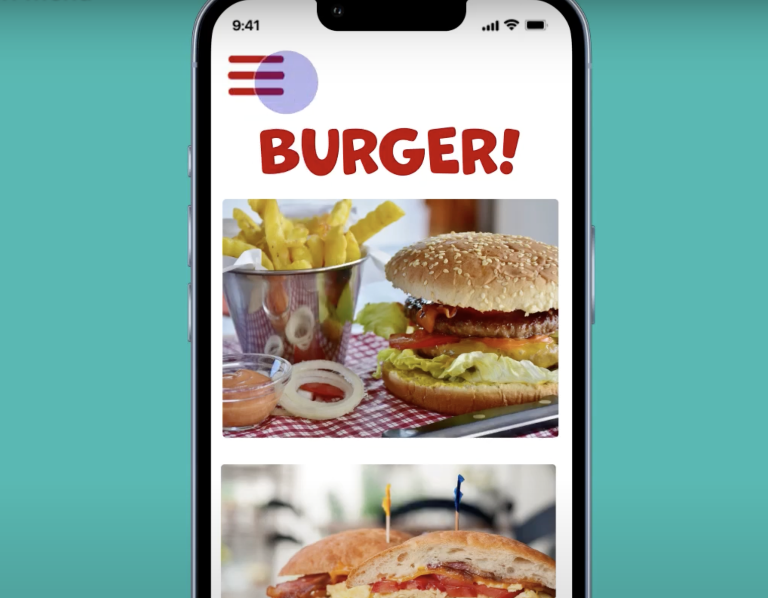
For this week’s project, I created a user interface animation loop. I wanted to make an iPhone mockup and animate a hamburger menu. And with that, I decided to make an app interface of a mock restaurant I called Burger! When the menu icon is pressed, the menu slides in, with each menu item quickly trickling in. I also tried to simulate a reaction force with the item icons by rotating them as they slide in and out. Not only that, but the icon also animates when going from a hamburger to an X and vice versa. I faced many small yet difference-making challenges when making this in After Effects, especially with trying to get the right ease animations. But overall, I had a lot of fun putting this together. Check it out below!



Я восхищен этой статьей! Она не только предоставляет информацию, но и вызывает у меня эмоциональный отклик. Автор умело передал свою страсть и вдохновение, что делает эту статью поистине превосходной.